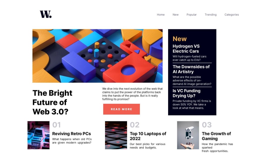
Design comparison
Solution retrospective
This is my third project any feedback is welcome i have a doubt i need to know how i can make to have that color when i open the nav_menu that black color and any advice about the responsive design is welcome im still learning about it
Community feedback
- P@KrishnaVishwakarma1595Posted about 1 year ago
Hi, @Alessandro-jpg
I've some points to mention that can help you to improve your solutions.
-
For the main logo image
<img src="assets/images/logo.svg">you should providealt="Logo". Keepalt=""empty for images for icons. -
You missed the hover state for the top navbar menu, the side container beside the main content where other news blogs are listed and the bottom three articles.
-
You provided
overflow: hiddenin the body tag, which prevents the user to scroll vertically. Either remove it or provideoverflow-y: auto. -
You need to work on spacing between content.
-
Use Modern CSS Reset
-
For the mobile menu background black overlay navigation you checkout this Responsive full screen menu or checkout my solution.
I hope these points will help you to improve your solutions.
Happy Coding
0 -
Please log in to post a comment
Log in with GitHubJoin our Discord community
Join thousands of Frontend Mentor community members taking the challenges, sharing resources, helping each other, and chatting about all things front-end!
Join our Discord
