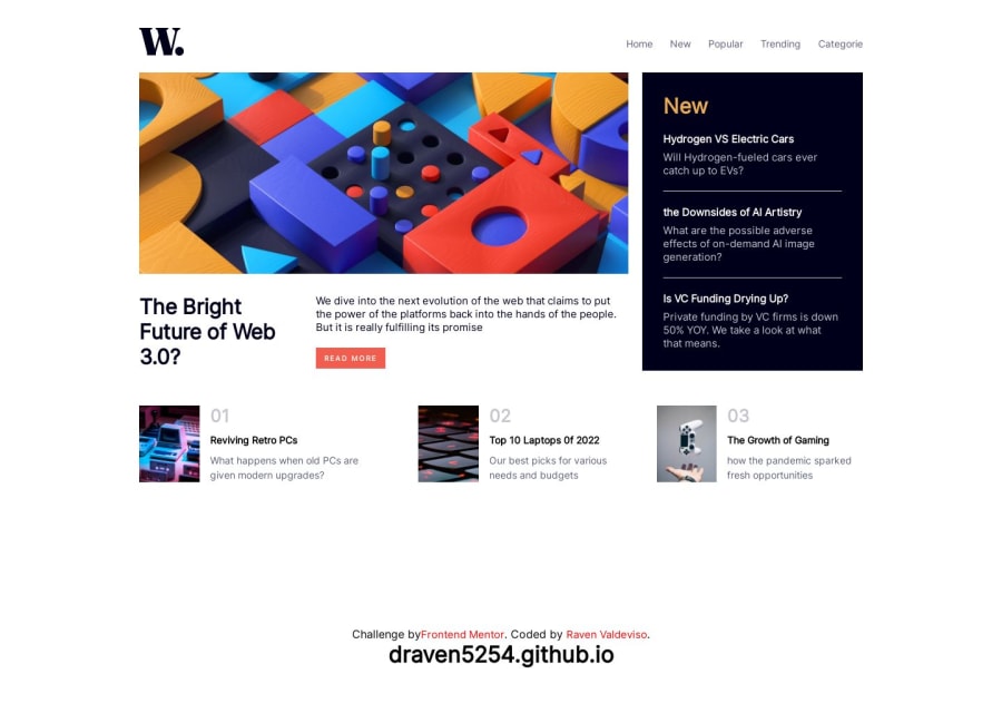
Design comparison
Solution retrospective
I find it difficult in the grid section when I'm building this project and I'm happy to build this project thank you for building this kind of website it helps to practice building a website for someone who like me a beginner and I want to be a web developer some day
Please log in to post a comment
Log in with GitHubCommunity feedback
- @NabilWasir
Great work on the desktop version
You can use
<main></main>instead of div/span to remove accessibility issues. And you haven't made the mobile version, If you want help you can visit my solution to this challenge.Hopefully, you will find my feedback helpful. If you do find my feedback helpful don't forget to mark this comment helpful!
Marked as helpful - @AdrianoEscarabote
Hello Draven, how are you? I truly loved your project's outcome, however I have some advice that I hope you'll find useful:
I noticed that you used a
buttonin which case the best option would be ana, because in my head when a person clicks on a button written Read more, he is not confirming a form, or something like, it will be redirected to another page, to read more about!to solve this problem do this:
<a href="/">Read more</a>As this page is a complete page, meaning it has a header, a main section, and a footer, wrap the main content in the main tag so that users who use screen readers can understand what the main content of the screen is. Every HTML document must contain a main tag.
The remainder is excellent.
I hope it's useful. 👍
Join our Discord community
Join thousands of Frontend Mentor community members taking the challenges, sharing resources, helping each other, and chatting about all things front-end!
Join our Discord
