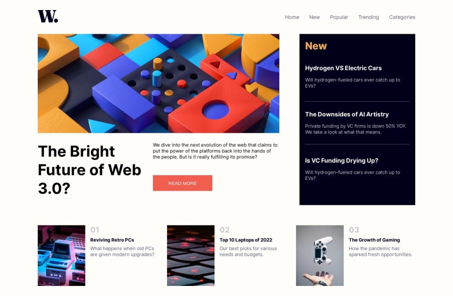
Design comparison
Solution retrospective
This one took me more time, than the previous two solutions, open to all the optimized approach. Also I found a issue with my code that when I make the screen size to mobile screen in my Desktop, the sidebar pops up, but it works great on the real mobile phone. Thanks for the help and appreciation, if I qualified with that :)
Community feedback
- @adityaphasuPosted about 1 year ago
Hi!
Don't worry about the sidebar popping up because it happens as soon the media query hits for the navbar at the mobile screen the
ul
goes fromflex
toabsolute
and since you have a transition on theul
you get that slight pop up as it transitions. If you remove the transition it won't happen but this is not necessary as transitions add to user experience. This only happens if you use devtools to stimulate the screens that's why it seems normal when you open the page on mobile.Some few suggestions regarding semantics:
- Instead of using div for
.article
you should use the actual<article>
tag. - For
.aside-info
div you can use the<aside>
tag instead.
You have done quite well actually! Good job!ππ»
Keep up the hard work and happy coding!πΊπ»
Marked as helpful0 - Instead of using div for
Please log in to post a comment
Log in with GitHubJoin our Discord community
Join thousands of Frontend Mentor community members taking the challenges, sharing resources, helping each other, and chatting about all things front-end!
Join our Discord