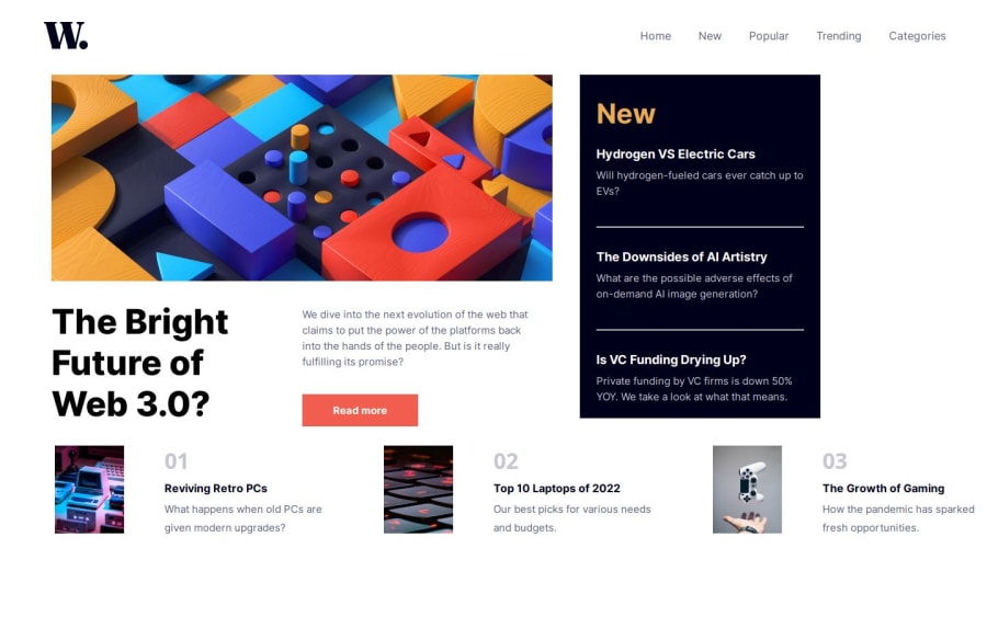
Design comparison
Solution retrospective
What I Am Most Proud Of One of the aspects I am most proud of in this project is how resourceful I became when tackling CSS Grid. Despite the initial challenges, I diligently utilized the CSS documentation. This approach helped me overcome the complexities of CSS Grid, greatly enhanced my problem-solving skills, and deepened my understanding of responsive design principles. My ability to adapt and learn on the go was pivotal in successfully achieving the optimal layout for various device screen sizes.
Plans for Improvement Next Time: Looking ahead to future projects, I'd like to implement several improvements to refine my development process and enhance the quality of my work. One specific area I plan to focus on is the structure and semantics of my HTML. For instance, I intend to incorporate .
What challenges did you encounter, and how did you overcome them?Challenge with Open and Close Functionality in JavaScript:
One of the significant challenges I encountered during this project was implementing the open and close functionality of the mobile navigation menu using JavaScript. The primary issue was ensuring that the menu behaved correctly across different devices and user interactions, such as tapping outside the menu to close it or interacting with menu items. To address this challenge, I adopted a straightforward yet effective approach:
Mobile Open and Close Variables: I defined specific variables in JavaScript to represent the state of the mobile navigation menu ). These variables helped track whether the menu was currently open or closed. Event Listeners: I added event listeners to the menu button for 'click' events. These listeners triggered functions to toggle the isOpen state, effectively showing or hiding the menu as needed.
Simple if/else Logic: I used simple if/else statements to manage the menu's visibility within the functions triggered by the event listeners. If the menu was open (isOpen is true), the script would close it, and vice versa. This logic ensured that the menu responded intuitively to user interactions.
CSS Transitions for Smoothness: I utilized CSS transitions to smooth out the open/close actions. This not only enhanced the user experience by providing a seamless visual transition but also aligned with the website's responsive nature.
What specific areas of your project would you like help with?I would like feedback and help with specific areas, such as whether the CSS transitions for smoothness work on the user end.
Community feedback
Please log in to post a comment
Log in with GitHubJoin our Discord community
Join thousands of Frontend Mentor community members taking the challenges, sharing resources, helping each other, and chatting about all things front-end!
Join our Discord
