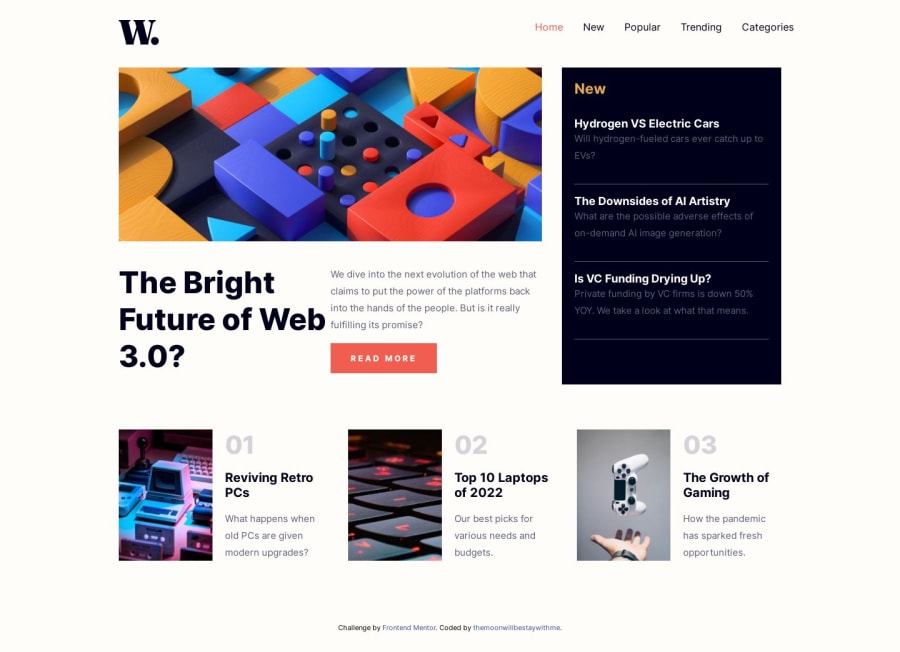
Design comparison
Solution retrospective
please advise me
I am open to any suggestions to improve and learn. Even if it's not related to coding, I'd love to hear from you.
Community feedback
- @Catalina-HasnasPosted over 1 year ago
Nice project, the best one I've seen for this challenge!
I like your usage of semantic HTML, the minimalistic javascript combined with HTML+CSS solution for toggling navbar. Responsiveness is good and you use srcSet for images.
The only thing I can say, if you want to take it up a notch, I would suggest to run your project through pagespeed.web.dev and try to implement those suggestions in order to get a better score. That's what I did with my solution and it was lots of fun and learning about giving the users a better experience.
I'm actually writing an article about the changes I implemented. I will post it in a few days. But here's a summary:
Image Optimization
Images tend to load slower than the other elements. When they do, they push the other elements around to make space for themselves, causing a shift. That's the cumulative layout shift metric. When you give an explicit width and height to the image, the browser knows how big it's going to be and it leaves the space for it.
Also, you can preload your largest image with high priority (similar to how you preconnected to googleapi) and it will descrease load time. This will help with the Largest Contentful Paint metric. Similarly, you can lazy load those images that do not appear instantly on the screen.
Fonts Optimization
Fonts also take more time to load and can cause a layout shift. Since you already know which font you're going to use and the 3 weights of that font, you can just download it and add it as static assets. This removes the need to request it from the server. But this is just a suggestion, your solution to preconnect is not bad :).
Semantic HTML
One thing you can add is
aria-attributes to the buttons. There are other attributes that help accessibility (screenreaders), butaria-labelis the most important one, because it gives a name to the button that doesn't have text. If you don't give a name, the visually impaired person doesn't know what the button does.Will update the comment with the link to the article when it's done. Hopefully it will be useful for you to improve an already-good project :). Happy coding!
0@ZENSE-THAIPosted over 1 year ago@Catalina-Hasnas Sorry for the late reply. Due to heavy rain where I live, the internet signal was unusable for several days. And I really appreciate your advice. It is very useful. And I will be looking forward to your future articles
0@Catalina-HasnasPosted over 1 year ago@winter2000TH Hello, here is the link to the article if you're interested :)
1
Please log in to post a comment
Log in with GitHubJoin our Discord community
Join thousands of Frontend Mentor community members taking the challenges, sharing resources, helping each other, and chatting about all things front-end!
Join our Discord
