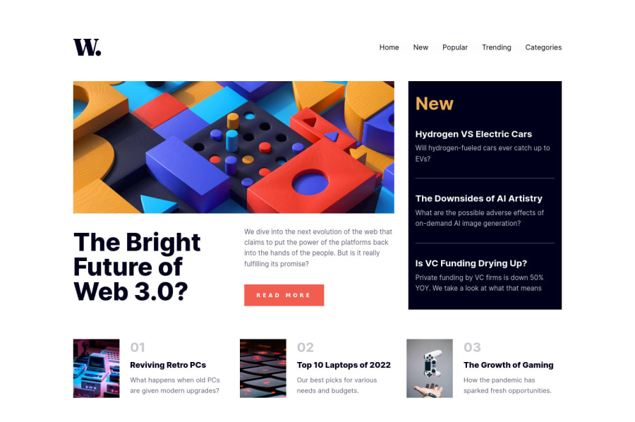
Design comparison
Solution retrospective
Suggestions and comments are welcome.
Community feedback
- @antonADevPosted about 2 years ago
Hi Olaf... First of all congratulations for finishing the challenge 🎉. The overall work is pretty amazing and you've did a great job, there are just some minor design differences:
-
As for your ul element, you don't need a role attribute for it, it's a semantic element and since roles are used to provide a structural description for a section of content, most of these roles should no longer be used as browsers now support semantic HTML element with the same meaning
-
As for the design, like I've said, your work is pretty amazing. Just check some colors of the given design and your project will be perfect. Impressive job done.
Again, it's an amazing try, this challange is not easy at all and you have to be proud of your achievement.
Hope my answer will help you to improve your skills and keep coding 😊
Marked as helpful0 -
Please log in to post a comment
Log in with GitHubJoin our Discord community
Join thousands of Frontend Mentor community members taking the challenges, sharing resources, helping each other, and chatting about all things front-end!
Join our Discord
