Solution retrospective
What specific areas of your project would you like help with?
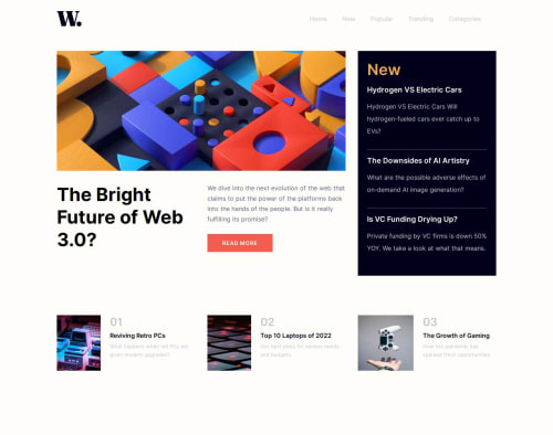
I attempted to use the hamburger image that was provided but couldn't figure out how to toggle from the hamburger menu to the close-icon so used my own from an old project. I also gave up on the the overlay when you click on the hamburger icon, I tried to use filter to blur but it would blur the whole thing including the nav bar. I would love feedback :)
Code
Loading...
Please log in to post a comment
Log in with GitHubCommunity feedback
No feedback yet. Be the first to give feedback on MinnaGrace's solution.
Join our Discord community
Join thousands of Frontend Mentor community members taking the challenges, sharing resources, helping each other, and chatting about all things front-end!
Join our Discord