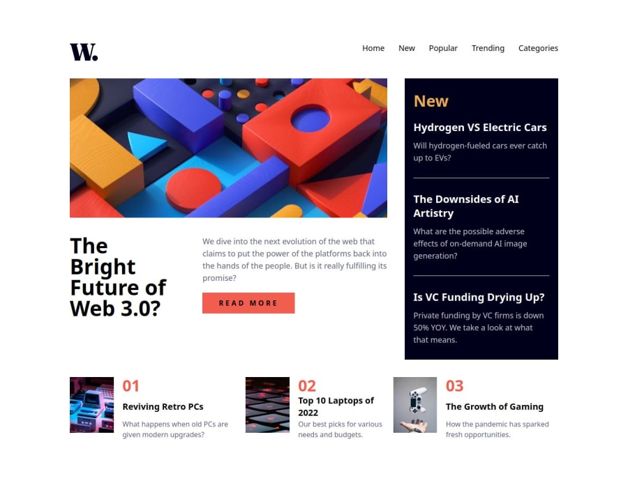
News web homepage with React and Tailwind


Design comparison

Solution retrospective
It was really fun building this layout, tailwind gave me all the tools I needed for styling. Although, I think it'd be useful to set a couple of rules at the main css file.
What challenges did you encounter, and how did you overcome them?The most challenging parts were when I built the navbar/sidebar component for the mobile version and when I adapted it for the Desktop view. I struggled a bit when building the logic with javascript and React hooks, but with a little help of internet and chatGPT I could do it.
What specific areas of your project would you like help with?Please review my code, tips and advices are always welcome!
Community feedback
- @RiscloverPosted 8 months ago
Hi Luis! The biggest tip I have for you is not using 1 long component for your app. An important concept in React - and in programming in general - is "SRP", which stands for Single Responsibility Principle. In a nutshell, the SRP is that every component/function should do one thing and do that one thing well. Your entire app is contained in one component, but following the SRP would mean having a component for the top navbar, a reusable component for each of the buttons in the navbar, a component for the "hero post", etc. Separate each of the primary parts (and reusable parts) into their own components.
The whole beauty of using React is being able to create reusable components. For example, the numbered blog post buttons (not sure what else to call them) at the bottom of the page (labelled 01, 02, and 03) would be perfect candidates for their own separate component, which I'll explain how to do.
In your main component (or whatever the parent component ends up being), you would have something like this array, which holds the information of each blog post button thing:
const blogPosts = [
	{num: "01", title: "Reviving Retro PCs", description: "What happens when old PCs are given modern upgrades?", img: (image path), imgAlt: "Computers"},
        {num: "02", title: "Top 10 Laptops of 2022", description: "Our best picks for various needs and budgets.", img: (image path), imgAlt: "Keyboard keys"},
	{num: "03", title: "The Growth of Gaming", description: "How the pandemic has sparked fresh opportunities.", img: (image path), imgAlt: "Hand throwing game controller"}
]
Notice that everything we need is there - the image and image's alt, the number, the title, and the description.
Then, down in the JSX:
<div className="blog-posts-container">
	{blogPosts.map(post => <BlogPost num={post.num} title={post.title} description={post.description} img={post.img} imgAlt={post.imgAlt} />)}
</div>
In the above code, I'm just iterating through the
blogPostsarray I created earlier using the.map()method. TheBlogPostcomponent (which I'll show you momentarily) is used for each item in that array, and I'm passing the 5 properties from each object as props -num,title,description,img, andimgAlt, giving the component access to the information.Note: You could absolutely do the number differently, such as removing
numfrom theblogPostsarray's objects entirely and relying on something like the index of the element to identify the number to use instead. For example, the first element is at index 0, so you might do something like {0${idx + 1}}, which would give you "01". Here's the JSX with that implemented instead:<div className="blog-posts-container"> {blogPosts.map((post, idx) => <BlogPost num={`0${idx + 1}`} title={post.title} description={post.description} img={post.img} imgAlt={post.imgAlt} />)} </div>Then, for the
BlogPostcomponent (which again represents just 1 of those blog posts):const BlogPost = ({num, title, description, img, imgAlt}) => { return ( <div className="blog-post-container"> <img className="blog-post-img" src={img} alt={imgAlt} /> <div className="blog-post-info"> <div className="blog-post-num-label">{num}</div> <div className="blog-post-title">{title}</div> <div className="blog-post-description">{description}</div> </div> </div> ) }Each of our props has been passed from the
blogPostsarray in the parent to theBlogPostcomponent.A side note, another important concept in React and programming is DRY - Don't Repeat Yourself. When you don't use reusable components, you're inevitably repeating yourself by creating the same elements over and over. By creating a reusable component instead, you're saving space, time, and brain power, and you're improving your app's maintainability. Now, changing the layout of these blog post buttons is as simple as changing the code in the
BlogPostcomponent once rather than going to each one individually to make the changes.I don't want to overwhelm you with stuff so I'll just leave you with that, as that was the biggest thing that jumped out to me. Your code isn't terrible, but you can definitely tell it's written by someone relatively new to React, simply because these concepts (SRP, DRY, etc) are core React concepts. But I mean, you're following stuff like naming conventions, formatting best practices, and (at least in this case) you seem to be using the hooks correctly, so not bad dude!
If you have any questions or if I was confusing, let me know!
Edit: The other big thing is the lack of responsiveness to your page. Granted, the page looks great at the 3 main sizes (375, 768, and 1440), but if you open up the browser resizing tool and start moving it, you'll see that some elements start to look a bit off (badly sized or aligned, for example). It may seem nitpicky, but users have different devices and screen sizes, so I just wanted to point it out and say that it's just something you'll have to learn. It basically comes down to using certain CSS methods to make sure that your layout is always consistent, no matter the screen size. One quick tip I'll say is to limit the max width for your main app component so that, at enormous screens, the elements don't spread out too far, ruining your layout.
Marked as helpful0

Please log in to post a comment
Log in with GitHub
Join our Discord community
Join thousands of Frontend Mentor community members taking the challenges, sharing resources, helping each other, and chatting about all things front-end!
Join our Discord