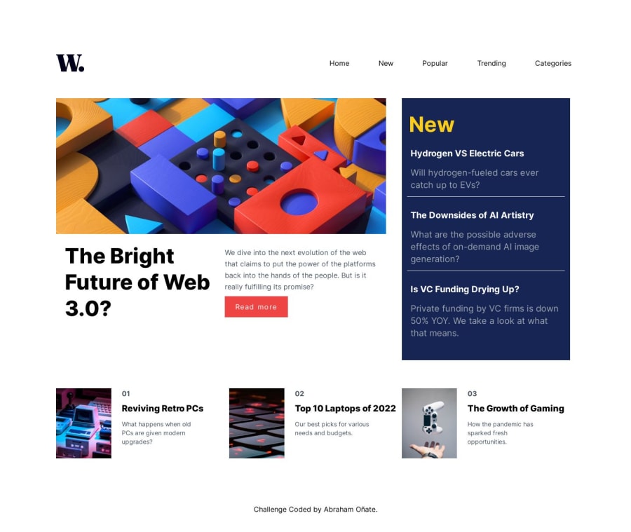
Submitted
News Responsive Page made with ReactJS and TailwindCSS
@Abraham0216
Design comparison
Solution retrospective
Hi guys! I've just finished this challenge where I used React and TailwindCSS, I'd be glad of any feedback you could have. Here are some observations:
-
It's the first time I have used Tailwind for a project and I have a question, is it normal in Tailwind to repeat the classes for elements that you want to be the same style? Does that respect the DRY principle?
-
When closing the menu on the mobile version, it has a little bug that I tried to solve, but when I was fixing it end up creating other problems, so I decided to keep this solution, but if you have a better one or a different approach of the logic it uses, share, please! Here is the part of the code I think it's the problem with the Nav component
<ul className={`md:absolute z-0 p-4 md:flex md:w-5/12 md:flex-row md:justify-between ${menuOpen ? "fixed top-0 right-0 bg-white w-56 items-start px-4 h-screen flex flex-col gap-7 translate-x-0 ":"translate-x-full opacity-0 md:opacity-100"} ease-in-out duration-500 `}>
At last, no need to say that If you think that I could have done something better or cleaner please tell me, I'd appreciate :)
Community feedback
Please log in to post a comment
Log in with GitHubJoin our Discord community
Join thousands of Frontend Mentor community members taking the challenges, sharing resources, helping each other, and chatting about all things front-end!
Join our Discord
