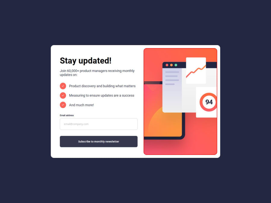
Design comparison
SolutionDesign
Solution retrospective
What are you most proud of, and what would you do differently next time?
proud that i managed to do the validation next time i would like to achieve it with less code.
What challenges did you encounter, and how did you overcome them?I struggled with the email validation but in the end i got it done with some research
What specific areas of your project would you like help with?the form validation if there any issues.
Community feedback
- @KazeemOluwanifemiPosted 11 months ago
Hii, Ashley :)
Nice solution!
Here to just drop a feedback
The desktop view should have a charcoal grey color as its background, then the main code's container should have border radius, box-shadow and centralized according to the design.
Happy Coding!
0
Please log in to post a comment
Log in with GitHubJoin our Discord community
Join thousands of Frontend Mentor community members taking the challenges, sharing resources, helping each other, and chatting about all things front-end!
Join our Discord
