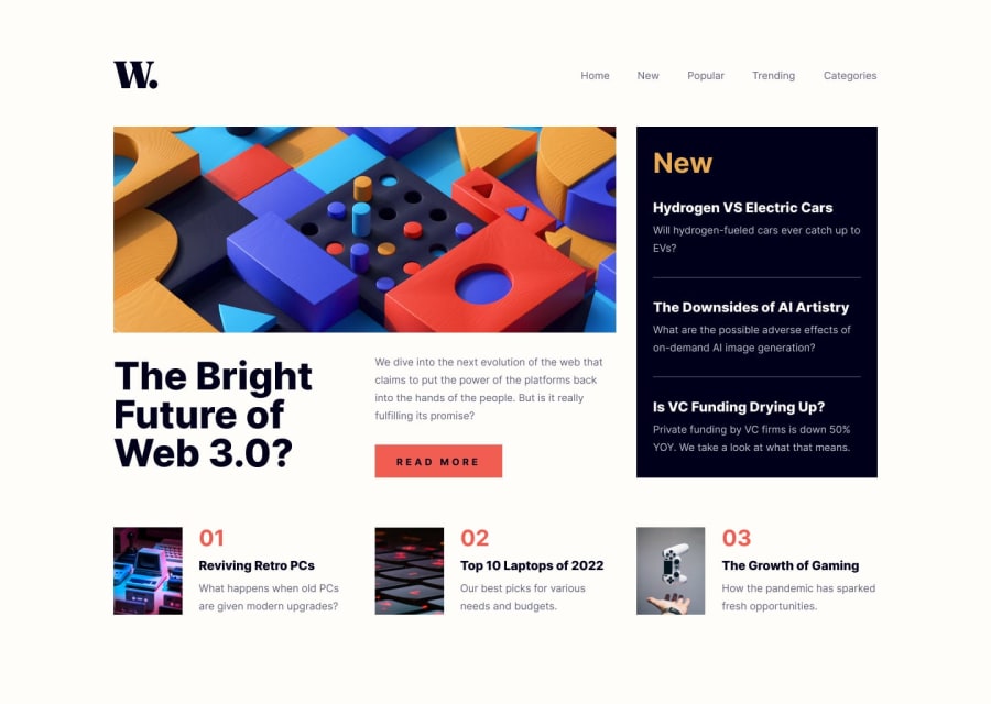
Design comparison
Solution retrospective
PLS RATE MY WORK:)
Community feedback
- @mynorzsPosted over 1 year ago
Hey, I liked your solution.
I will take the liberty to give you some visual feedback, since my main career is UX/UI Design and I have long years of experience giving visual review to developers:
You could go for more fidelity with margins and paddings to match the design as much as possible. On mobile, not caring about margins can lead to a confusing reading, not knowing where each section ends. It gets a weird reading to have paddings and margins too different, you could try defining a consisten margin, padding and gap that is easily repeated.
On mobile, the Read More button is too small, not only the size of the button, but also the font size. Right now you have it at 31px height, you could try not going below 44px, it will match the design and will represent a well implemented usability practice.
You could try delivering a responsive experience instead of an adaptive one. Right now it just snaps between mobile and desktop, but if you put a tablet width in the browser, it displays the mobile design on a reduced manner. I know that specifications do not require all devices, but by making it responsive you cover your back a bit more and the mobile design could expand instead of remaining in one fixed width.
I hope my tips can help you, and I wish you the best.
0
Please log in to post a comment
Log in with GitHubJoin our Discord community
Join thousands of Frontend Mentor community members taking the challenges, sharing resources, helping each other, and chatting about all things front-end!
Join our Discord
