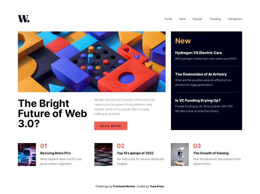
Design comparison
Solution retrospective
It was a fun project. At first, I couldn’t decide whether to start with mobile or desktop, but I decided to start with desktop. I found it easier to design the grid system that way. I can't say I had much difficulty with the design. Although I wanted to create the mobile menu using the same list items, I had to make them separate list items due to issues I encountered with the transition
What specific areas of your project would you like help with?I wanted to reuse the li items from the desktop navigation in the mobile menu, but when the mobile menu closes, the height and width change, and the position of the navigation menu also shifts. The issue persists even after separating the mobile and desktop menus. I temporarily resolved it with opacity and transition speed, but I couldn’t pinpoint the cause or figure out a proper solution. When I disable opacity and reduce the translate value, the problem resurfaces.
Community feedback
Please log in to post a comment
Log in with GitHubJoin our Discord community
Join thousands of Frontend Mentor community members taking the challenges, sharing resources, helping each other, and chatting about all things front-end!
Join our Discord
