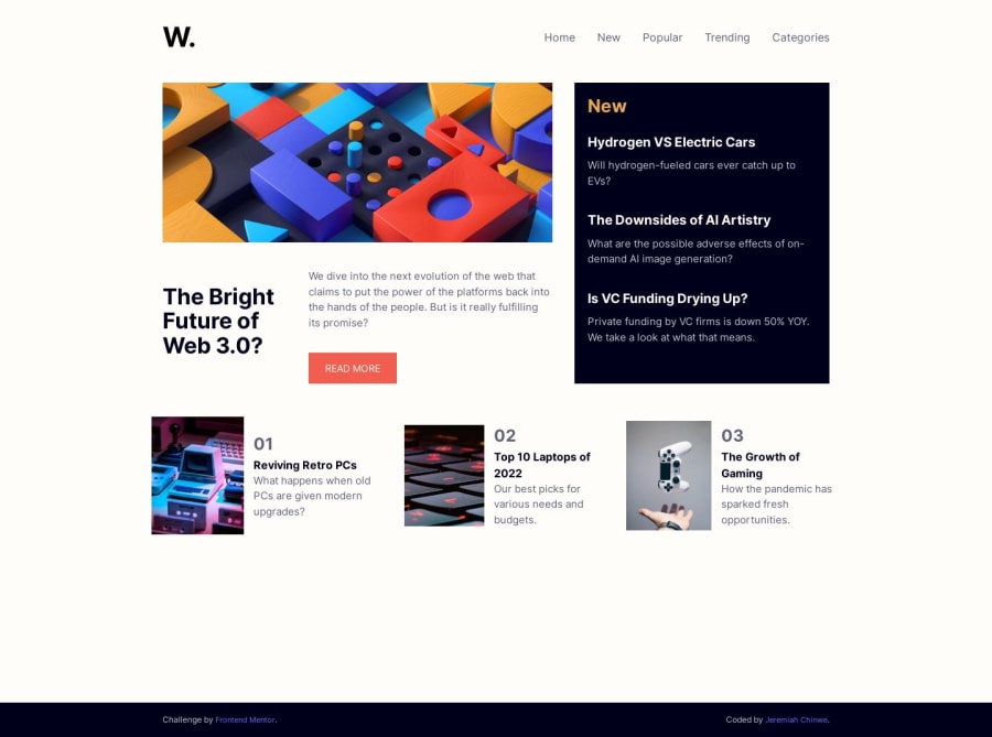
News Homepage with React and CSS Flexbox
Design comparison
Solution retrospective
Building this project triggered a question in me because I was using the desktop design to determine how I would begin the project with mobile design.
What's the recommended approach to front end development Mobile first or Desktop first approach?
Community feedback
- @istealersn-devPosted over 1 year ago
Congratulations! on completing project.
It should always be mobile first approach unless you are building an application that is never meant for mobile. Quick feedback if this helps:
- It looks like you attempted the character 'W' for logo instead of the actual logo shared in the style kit
- Hover behaviors for button, New section items seem inconsistent
- HTML semantics state you don't need a
<section>tag inside<header>instead you can use<nav>or other elements.
Hoping these are helpful!
Marked as helpful0@JeremiahChinwePosted over 1 year ago@istealersn-dev Oh yes I did attempted character W 😔 I will fix that.
-
Ok I will fix the hover behaviors.
-
Wow! 👏 I just learned that now.
Thank you so much Stanley for your constructive feedbacks. I truly appreciate you. I'm becoming better 😆
0
Please log in to post a comment
Log in with GitHubJoin our Discord community
Join thousands of Frontend Mentor community members taking the challenges, sharing resources, helping each other, and chatting about all things front-end!
Join our Discord
