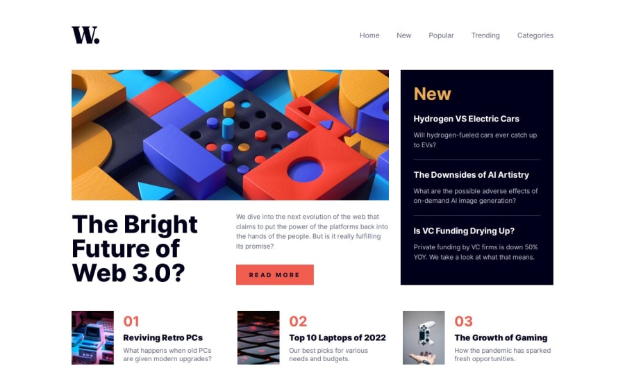
Not Found
Not Found
Not Found
Not Found
Not Found
Not Found
Not Found
Not Found
Not Found
Not Found
Not Found
Not Found
Not Found
Not Found
Not Found
Not Found
Not Found
Not Found
Not Found
Not Found

Submitted

News Homepage with hamburger menu.

Caelus 520

@Caelus111

Desktop design screenshot for the News homepage coding challenge

This is a solution for...

  • HTML
  • CSS
  • JS
2junior
View challenge

Design comparison


SolutionDesign

Solution retrospective


What are you most proud of, and what would you do differently next time?

I like this challenge, really focused on getting it as close as possible to the og design, and it was fun, the Js is working but you can break it if you play with it, like the overlay is wonky and the ul too can disapear.., so maybe next I think will work on the burger menu better.

if you have a solution, I will be delighted to know how to make a better burger menu.😁✔

What challenges did you encounter, and how did you overcome them?

I think it was the presicion that I needed so the measuring and the color picking was the hardest part, but with time I got all good!

What specific areas of your project would you like help with?

I need more explantion on how to make a better burger menu and maybe make the header fixed to the top of the page.

And of course all advices are appreciated!👍

Community feedback

alvarozama 360

@alvarozama

Posted

Your page looks good when loaded on either desktop or mobile screen sizes. However, transitioning from one into the other makes things go a little crazy before falling into place. Some things I'd like to point out, mainly pertaining to styling, are the following:

  1. For some reason, the lines separating the articles in the New section overlap with other elements when changing the viewport size.
  2. The size of the img elements on the bottom section is different for each image. You could just give them the same fixed width and it would look much more uniform.
  3. Your mobile menu could use some padding since al <li> elements on the nav are too close to the edge and it looks weird.

Other than that, everything seems well done. Your approach to the burger menu is similar to mine. I, however, didn't add an overlay element and intead just 'faked' the overlay by adding a huge box-shadow to the mobile menu. Feel free to check it out. It's not perfect, but for the purposes of this challenge, I think it's a more simple way to get similar results.

Anyway, you did a very good job. Keep it up!

1

Caelus 520

@Caelus111

Posted

@alvarozama thank you for these notes, I will definitely redo some things with latter projects when I get used to making landing page style websites... about the mobile menu, I watched some tutorials and I kind of learned the huge shadow method by accident 😭. anyway thanks again for the constructed feedback!!

1

Please log in to post a comment

Log in with GitHub
Discord logo

Join our Discord community

Join thousands of Frontend Mentor community members taking the challenges, sharing resources, helping each other, and chatting about all things front-end!

Join our Discord