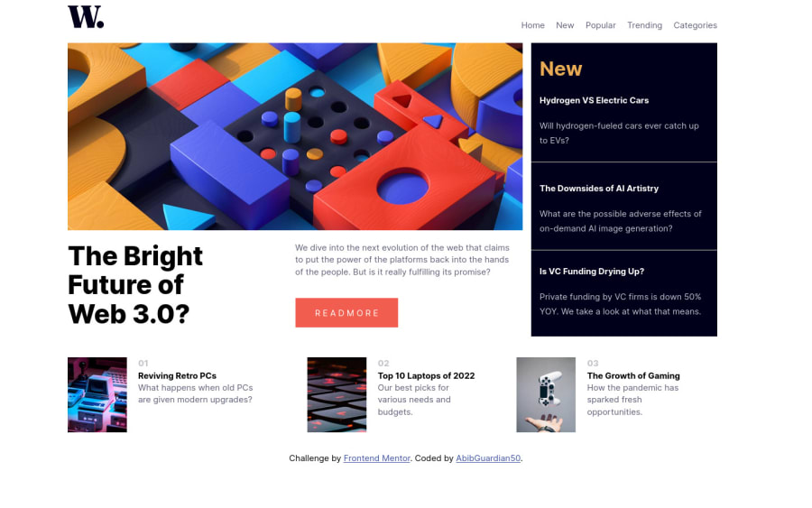
Design comparison
SolutionDesign
Solution retrospective
Any feedback and critics is welcomed!
Community feedback
- @peta-8-bitPosted about 2 years ago
Congratulations @AbibGuardian50 for completing you first Junior level challenge 🎉🎉
I am also fairly new to web development, but here are my two cents:
- I would recommend having the logo and navbar out of the main grid since they go on one line only.
- The responsive layout works alright, however the navigation items cant be seen, the main picture can be replaced with the square picture.The layout needs to be centered in both desktop and mobile version.
- Kudos on incorporating semantic tags like main and section. My only recommendation is the right-content and bottom-content can be wrapped in the section tag and the individual articles inside article tag.
I know it sounds like so much work, but when i did this challenge i took 1 full day just trying to figure out the navbar. I don't even want to talk about the entire challenge, but it gets waaayyy easier after doing it right one time.
Happy Coding╰(°▽°)╯
Marked as helpful0@AbibGuardian50Posted about 2 years ago@peta-8-bit Thanks for your feedback,this is helpful and make great improvement for my next challenge Have a great day!
0
Please log in to post a comment
Log in with GitHubJoin our Discord community
Join thousands of Frontend Mentor community members taking the challenges, sharing resources, helping each other, and chatting about all things front-end!
Join our Discord
