Submitted almost 2 years ago
Responsive landing page using foundational front-end languages
@Designer-space
Design comparison
SolutionDesign
Solution retrospective
open for feedback
Community feedback
- @sulemaan7070Posted almost 2 years ago
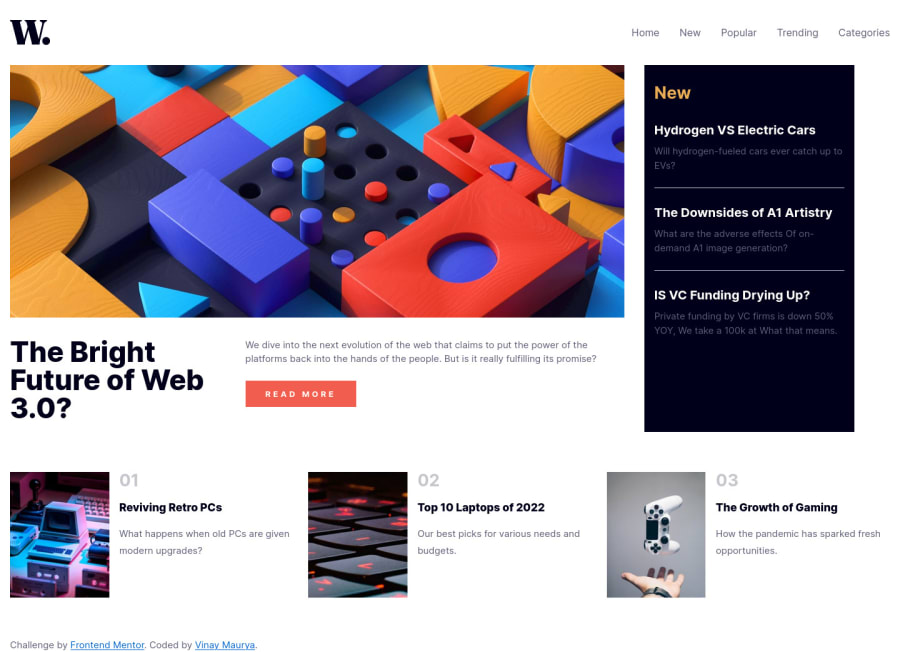
hey Vinay Maurya😄,here are a few things you can do to make your site perfect and accurate to the design...
1.Firstly the width of the body should be
75% to 80%andmargin-left:auto,margin-right:auto...that will center the whole content of the body with a margin.2.On the mobile version when we hover over the
hamburger menuyou use thecursor:pointer.3.As for the last 3 divs you can make the images a little smaller and align the text with the image...
everything else seems good keep up the good work.... happy coding💯🔥🔥
0
Please log in to post a comment
Log in with GitHubJoin our Discord community
Join thousands of Frontend Mentor community members taking the challenges, sharing resources, helping each other, and chatting about all things front-end!
Join our Discord
