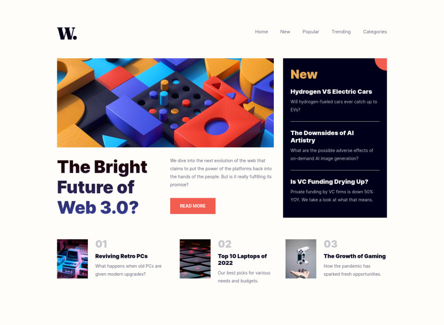
News Homepage - Vanilla CSS (Burger Menu CSS ONLY) 🍔
Design comparison
Solution retrospective
👾 Hello, Frontend Mentor coding community. This is my solution for the News Homepage
An amazing challenge to practice grid. I didn't know any JS yet, so I created the burger menu 🍔 using only CSS.
🍚Follow me in my journey to finish all HTML/CSS only challenges (23/24)! Gotta Catch ’Em All
Ill be happy to hear any feedback and advice!
Community feedback
- @jamescheinPosted about 2 years ago
Lovey stuff. All the extra touches make yours an interesting extended challenge tutorial. I was struggling to use :hover pseudo to create a toggle to no avail - of course an input element is a good solution for this job of a CSS toggle. Although, I am still wondering if there is any way to use a button element as a toggle in CSS for a maybe more elegent and semantically solid solution?
May I recommend a link around all the individual news or second-level story blocks content and fixing them up so when you roll over any part of a story the headline is highlighted and a click anywhere on the story will take you to the associated page.
Many thanks. Very useful.
Marked as helpful1@correlucasPosted about 2 years ago@jameschein Hey James, thanks for the time spent writing this feedback! The input element is cool, but I've used it due my lack of knowledge of JS. Many of my previous solution I tried to implement a lots of things that are 100% easier with JS without CSS tricks, now I decided to finally study JS and stop to struggle to do complex things with CSS that are easier with JS.
About the story blocks I'll apply your suggestions ASAP, I wasn't thinking about that. Thank you for the tip!
Have a nice day James. Keep it up =)
1 - @AdrianoEscarabotePosted about 2 years ago
Oi Lucas, de boa?
Parabéns por completar esse desafio man, ficou muito bom gostei dos detalhes do burguer menu auahuhauh ficou realmente muito bom! agora eu consegui entender como você fez ele com o input, muito criativo auahuahu
Uma dica se você quiser adicionar uma animação bem simples, no menu, podemos fazer isso:
.menu {
    /* display: none; */
    visibility: hidden;
    width: 0;
    height: 0;
    transition: 0.8s;
    opacity: 0%;
}
e quando estiver ativo:
.menu-btn:checked~.menu {
    width: 180px;
    height: 240px;
    opacity: 90%;
    visibility: visible;
    /* display: flex; */
}
o resto esta otimo!
espero que ajude... 👍
Marked as helpful0@correlucasPosted about 2 years ago@AdrianoEscarabote Valeu! Chegou a hora de aprender JS pra parar de fazer essas maracutaias com CSS hahahaha
1 - @jorgealves-bPosted about 2 years ago
Is perfect ! I can't join flex-box with grid. I need to study more, but there's something that makes me pensive... a lot is said about semantics, but people use a lot of divs and classes.
this challenge I only managed to do the mobile version, it's frustrating.
Marked as helpful0 - @chukwudobe-MicahPosted about 2 years ago
Bro how did you do your menu bar without js?
1@correlucasPosted about 2 years ago@chukwudobe-Micah Hey my friend! I've used an input under the
burger imagethat activates the menu. Check my repository and you'll see inside the html the<input>and inside the css the activation on click that shows and hides menu.=)
0@chukwudobe-MicahPosted about 2 years ago@correlucas okay then, thanks a lot. Also, I've been meaning to ask a question. On your testimonial grid solution (web view) I saw that if you over a container, the rest of the containers blurred, I've been meaning to ask how you pulled that off? How did an action in a container affect the other containers and the whole body?
0
Please log in to post a comment
Log in with GitHubJoin our Discord community
Join thousands of Frontend Mentor community members taking the challenges, sharing resources, helping each other, and chatting about all things front-end!
Join our Discord
