Submitted about 1 year ago
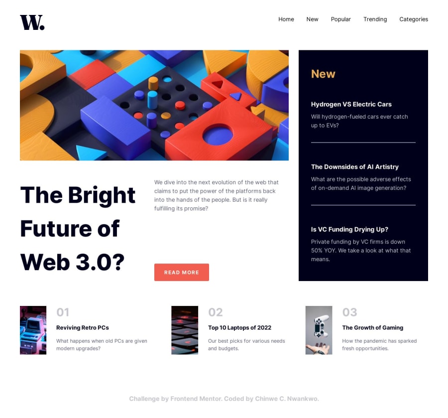
News homepage using vite and tailwind css
@Kiraadaves
Design comparison
SolutionDesign
Solution retrospective
What did you find difficult while building the project? Nothing really, I'm getting the hang of things gradually.
Which areas of your code are you unsure of? I'm unsure of the last 3 card images. I noticed that on mobile vies, the middle image appears wider than the rest. Still have'nt found a solution to that. Will appreciate help solving that.
Do you have any questions about best practices? Yes please! Definitely open to tips on writing clean modular codes as well as best practices.
Community feedback
Please log in to post a comment
Log in with GitHubJoin our Discord community
Join thousands of Frontend Mentor community members taking the challenges, sharing resources, helping each other, and chatting about all things front-end!
Join our Discord
