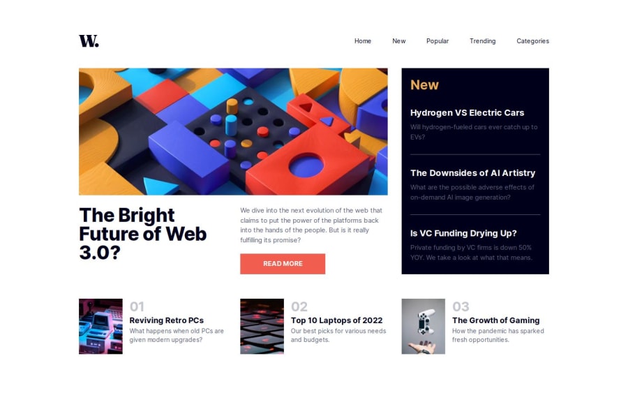
News Homepage using Next.js and Tailwind


Design comparison

Solution retrospective
I used the <picture> element with <source /> and <img /> to load the right version of the main image, depending on the screen size. To achieve this I used the new (added in 14.1.0) Next.js getImageProps function. I'm not sure I did everything right, if someone knows more please tell me if something's wrong. Here's the code:
I used getImageProps to get the srcSet for the desktop version:
const {
  props: { srcSet: desktop },
} = getImageProps({
  ...common,
  width: 730,
  height: 300,
  quality: 80,
  src: images.desktop,
})
Then I used it to get all the props for the <img /> element (used on mobile):
const { props } = getImageProps({
  ...common,
  width: 610,
  height: 530,
  quality: 80,
  src: images.mobile,
})
Finally, I return the picture element with all the data, including the sizes attribute:
<picture className="md:col-span-2">
  <source media="(min-width: 1024px)" srcSet={desktop} />
  <img
    {...props}
    className="h-auto w-full"
    sizes="(min-width: 1180px) 708px, (min-width: 780px) calc(56.58vw + 52px), calc(100vw - 32px)"
  />
</picture>
I calculated the value of the sizes attribute using this tool.
Is this the right way to do it? The example on the Next.js docs uses two <source /> elements, one for desktop and one for mobile, and an <img /> element with its own srcset. I removed the <source /> element for mobile, since its the same srcset as the <img /> element, hope that's correct.
Other than that, any other suggestion is welcome...
Community feedback
Please log in to post a comment
Log in with GitHub
Join our Discord community
Join thousands of Frontend Mentor community members taking the challenges, sharing resources, helping each other, and chatting about all things front-end!
Join our Discord