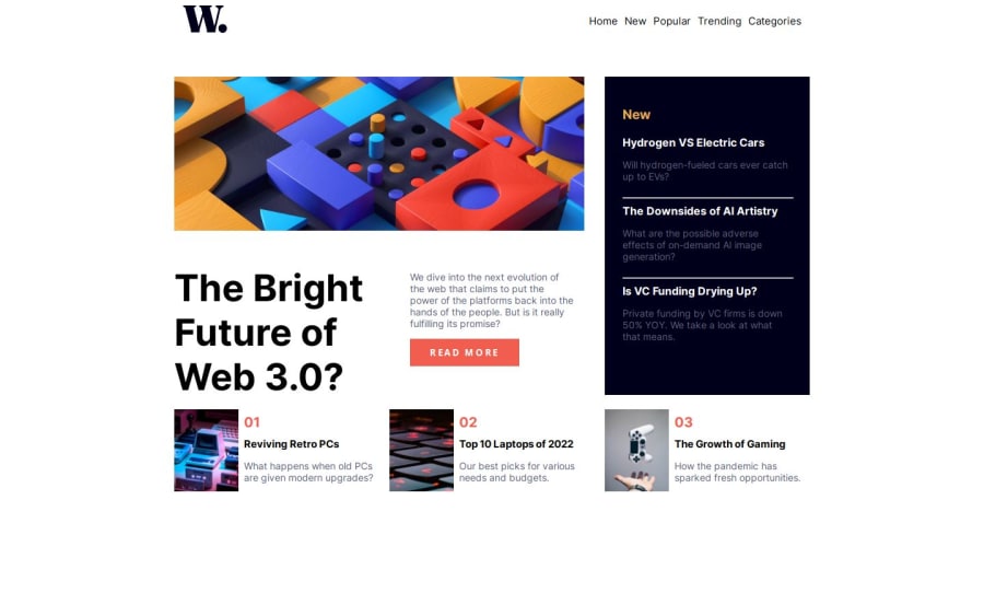
Design comparison
Solution retrospective
I am most proud of create this project with better understanding and next time i can do better
What challenges did you encounter, and how did you overcome them?No challenges will come.
What specific areas of your project would you like help with?the area when we click on menu button the background that seen behind the menu bar,i can apply the opacity on the particular part but the opacity will apply on the overall desgin.any can help solve this issue please solve them.
Community feedback
- P@VishikaPosted 5 months ago
Hello! You can add a box shadow to your mobile navigation to achieve this affect:
.menu-bar-mobile {
    box-shadow: 0 0 0 100vmax rgba(0, 0, 0, 0.7);
}
You may also want to consider clamping your h1 since the text will be too large when you have a tall screen. I used utopia to calculate it
.heading {
    font-size: clamp(2.5rem, 2.1479rem + 1.5023vw, 3.5rem);;
}
Marked as helpful0
Please log in to post a comment
Log in with GitHubJoin our Discord community
Join thousands of Frontend Mentor community members taking the challenges, sharing resources, helping each other, and chatting about all things front-end!
Join our Discord
