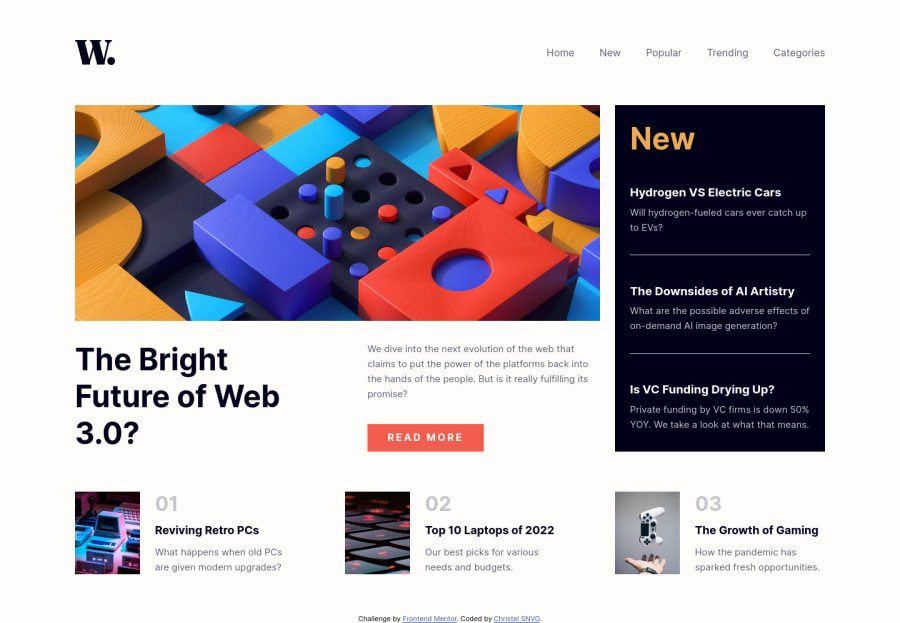
Design comparison
Solution retrospective
For this project, realizing the tablet design was a bit difficult. I would like your opinion on it.
Community feedback
- @grace-snowPosted almost 2 years ago
There is too much to feed back on here. I’ve only looked at the html so far and it needs a lot of changes. I recommend you slow down, focus on smaller single component challenges, paying very close attention to learning good html structure before anything else!
In particular learn about
- landmarks and how to use them correctly
- heading use, order and why these are so important
- how and when to write alt text on images
- responsive images eg picture element
- labelling interactive elements
- visually hidden headings or other content (how to accessibly hide content)
- aria-expanded button disclosure patterns
- why you should not be loading multiple css files like this
It’s really important to build proper html foundations. Learn that and you’ll be set up for the rest of frontend work
After that there are lots of css foundations that need ironing out too. But one thing at a time, focus on html first
2
Please log in to post a comment
Log in with GitHubJoin our Discord community
Join thousands of Frontend Mentor community members taking the challenges, sharing resources, helping each other, and chatting about all things front-end!
Join our Discord