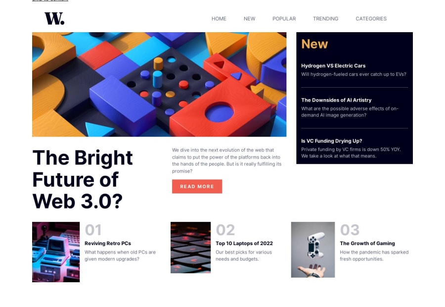
@ola-irawo
Posted
For the first part, to make the "New Column" equal to the other one, on the container or parent element you can make use of "display: grid".
@ClaudiuSonica
Posted
@ola-irawo With grid is designed the layout. My problem is that the column on the right with blue background is not equal to the ones in the left side as it is on the solution design
@ola-irawo
Posted
@ClaudiuSonica the first part to make it easier to solve, in your code, put everything inside a container. The parent element is "main", you can create a "section" under main and put the first part of the code there. After doing this, the "top-image-flow" div, and "top content" div, put it inside its own container(you can create a div for this).
In the "new-section", the "new-div" and the "middle bg-dark text-off-white wrapper" will be sibling to one another and they will share a parent which is the "new-section"
On the "section" created you can do this:
.new-section{ display: grid; grid-template-column: 2fr 1fr; gap: 1em; }
Doing this will make the first part equal to one another in height. You can add your styling to make the interface look better.
For the bottom, you can also make use of "grid" or "flex". In this case flex is better. You can put everything in the bottom in a container then on the container add...
.new-container { display: flex; justify-contents: space-between; }
Note: for this to work, each section in the ".new-container" also have to be in a container. There are 3 section or 3 different items in the bottom area. The 3 different items will have to be siblings to each other while the "new-container" is their parent.
You can add your styling to make the interface look better.
I hope this helps you.
Marked as helpful
@ClaudiuSonica
Posted
@ola-irawo Thanks. It’s a great idea. Thanks a lot
@ola-irawo
Posted
@ClaudiuSonica Glad I could help.