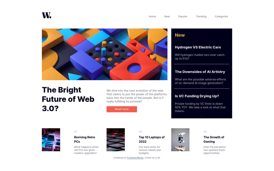
Design comparison
SolutionDesign
Solution retrospective
This is my third challenge this time using both Grid and Flexbox for layout. This is also my first whole web page for a long while. Do you find my solution meets the goals of the challenge?
- View the optimal layout for the interface depending on their device's screen size (even on large screen sizes)
- See hover and focus states for all interactive elements on the page
- Toggle the mobile menu
For the mobile menu I ended up adding an event listener on the mobile menu icon which adds another event listener to listen for the closing event. This latter event listener will then remove itself when activated. Do you think it is a good habit to remove even listeners that are not attached to active elements on the DOM or is it mostly unnecessary?
Community feedback
Please log in to post a comment
Log in with GitHubJoin our Discord community
Join thousands of Frontend Mentor community members taking the challenges, sharing resources, helping each other, and chatting about all things front-end!
Join our Discord
