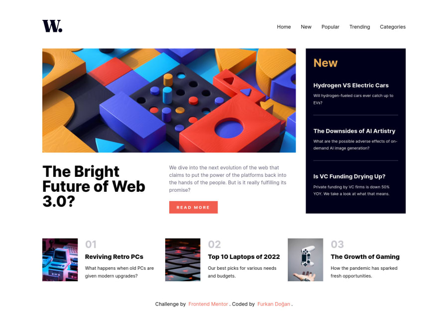
Design comparison
Solution retrospective
The only part that I'm not feeling that good about is the popular news section at the bottom of the page. I couldn't find any other way but to use those images as backgrounds for the divs. I believe there should be some way to use them as img tags, but it was challenging and couldn't do it for now.
Any idea, feedback is appreciated.
Community feedback
- @IkuewumiPosted over 1 year ago
Hi👋. Awesome Project. About the images issues,
In manipulating an image, especially its dimensions without squishing the image, I don't think you'll find a better solution than the css object-fit property / family of properties. You can read more on this on the MDN website, but you could use it like so:
selector {
	object-fit: cover;
	object-position: top left;
	width: 300px;
	height: 100%;
 }
Hope you find this helpful. Your project is great. Feel free to ask more questions and keep coding👍,
Ayobami
0@doganfurkanPosted over 1 year ago@Ikuewumi Thank you for your suggestion. I'm actually aware of "object-fit" and tried it too. But there were some bugs, and it was not always working. But they can be some problems related to other elements. I agree with you about "object-fit" being the most reasonable solution. I may try to implement it soon. Then again, thank you so much, have a good day.
0
Please log in to post a comment
Log in with GitHubJoin our Discord community
Join thousands of Frontend Mentor community members taking the challenges, sharing resources, helping each other, and chatting about all things front-end!
Join our Discord
