Design comparison
SolutionDesign
Solution retrospective
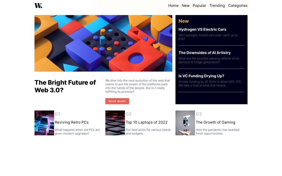
The most challenging part of this project is still removing the bottom border for the last child of the New post section. I'm not sure if I'm going the right way with regard to showing and hiding the menu on the different screen sizes.
Community feedback
Please log in to post a comment
Log in with GitHubJoin our Discord community
Join thousands of Frontend Mentor community members taking the challenges, sharing resources, helping each other, and chatting about all things front-end!
Join our Discord
