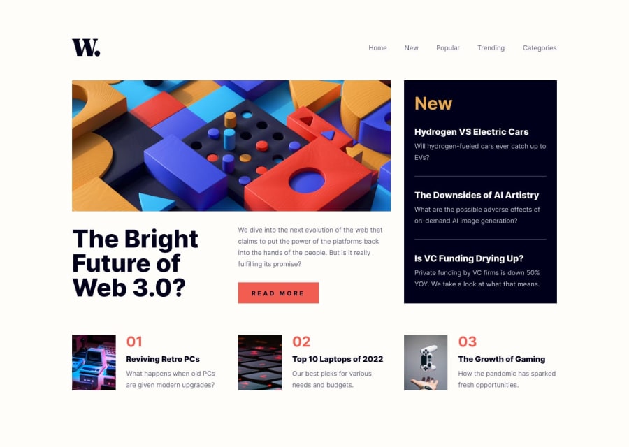
Design comparison
SolutionDesign
Community feedback
- @PriyanshuSahaniPosted over 1 year ago
Great job on the challenge, it is an extensive design
There are some fine tweaks you can make to improve user experience:
- The paragraph text on New section is hard to read. Setting it to off white will make it pop out a bit more.
- Align the website logo with the nav links. You can do so by clubbing them in a flex container and set
align-items: center. In your case doing that on the header element should do.
Marked as helpful0
Please log in to post a comment
Log in with GitHubJoin our Discord community
Join thousands of Frontend Mentor community members taking the challenges, sharing resources, helping each other, and chatting about all things front-end!
Join our Discord
