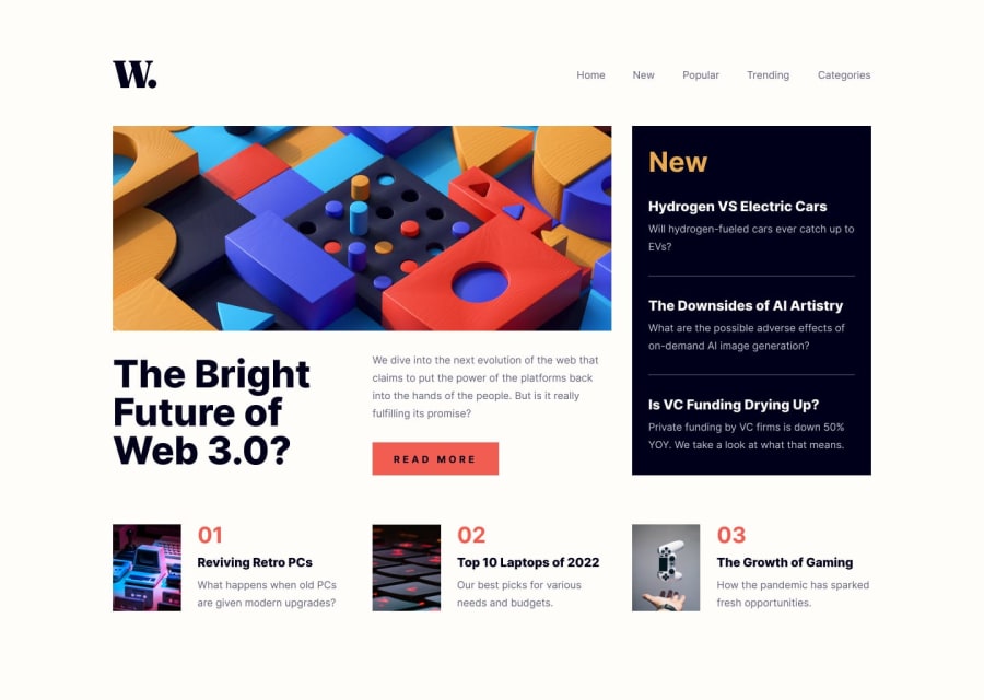
Design comparison
SolutionDesign
Community feedback
- @aouintihouariPosted about 2 months ago
Good job, however the content is a little bit squashed in the screen, there should be more margins between sections and elements, also the button background color doesn't change when hovered over, and on smartphone screens it gets shifted to the left of the screen, also the close button should be on the left, and the last item in the news shouldn't have a line under it.
0
Please log in to post a comment
Log in with GitHubJoin our Discord community
Join thousands of Frontend Mentor community members taking the challenges, sharing resources, helping each other, and chatting about all things front-end!
Join our Discord
