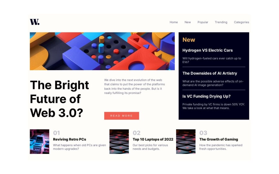
Design comparison
SolutionDesign
Solution retrospective
I had a problem with grid on 1024px-1440px width.
Please log in to post a comment
Log in with GitHubCommunity feedback
- @WillamiFerreira
One tip: be clearer with your doubts. In that case, to say what problem exactly do you had.
I suppose your problem is here. Learn a little bit more about media queries.
  #container {
    width: 80%;
  }}
Join our Discord community
Join thousands of Frontend Mentor community members taking the challenges, sharing resources, helping each other, and chatting about all things front-end!
Join our Discord
