Design comparison
Solution retrospective
Hi Guys ...I am Back by submitting another project ..if you have another suggestion for this project ...I welcome the suggestions :)
Community feedback
- @maxime927Posted about 2 years ago
Hi Akshita,
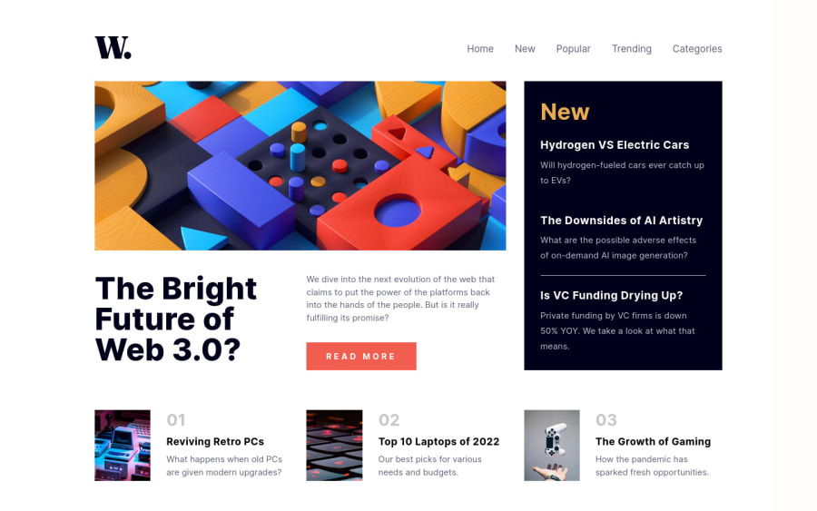
It seams good for desktop 1440px and mobile 375px but between those sizes it's broken. I can propose you for the fluidity of your webpage to use max-width for your container to let the width depend of your screen size, you should then define width by percentage with a small cross-multiplication.
Pay attention to the vertical spacings too, it seams good in your screen but, for exemple, for the bloc "News" at the right, if we have a tablet or a small screen (13") there is almost no vertical spacings.
I can advise you as well to use the google extension : PerfectPixel to compare your integration with a jpg/png of the design, with that, you can assure you that you respect totally the designer's expectation. :) I propose it every time when i see that there are a lot of little mistakes but even if there is nothing it's a must have for me ;)
Marked as helpful1@ShanviePosted about 2 years ago@maxime927 Thank you, sir ..like would like to apply your suggestion in my next frontend mentor project.
0
Please log in to post a comment
Log in with GitHubJoin our Discord community
Join thousands of Frontend Mentor community members taking the challenges, sharing resources, helping each other, and chatting about all things front-end!
Join our Discord
