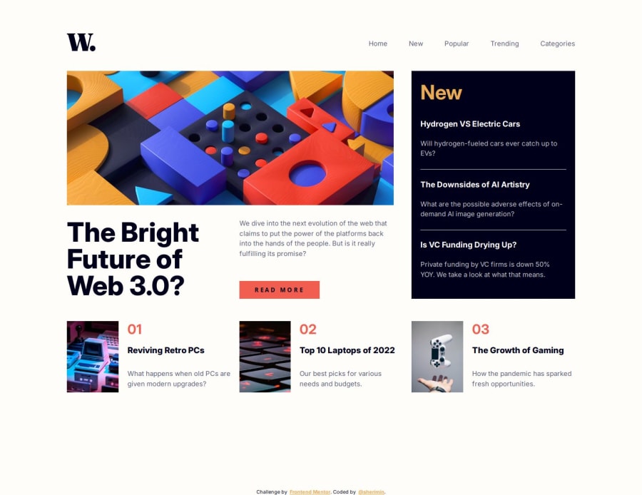
Design comparison
Solution retrospective
any feedback is welcome <-;
Please log in to post a comment
Log in with GitHubCommunity feedback
- @khatri2002
Hi! The developed solution looks great! The alignment of each item is perfect, as per the design reference. Excellent job!
I just have a minor suggestion:
The text hover effect is applied to both the bottom article and side article, changing the text color on hover. However, if you notice, the
h4(in the bottom article) andh3(in the side article) are occupying more space than the text itself. As a result, even when the cursor is below the text and not touching it, the hover effect is triggered.This happens because the heading elements are taking up the full available space due to their container being a
grid.To fix this, consider adding:
align-self: baseline;to the heading elements. This will ensure they only take up the space they need for their text, while maintaining proper alignment.
Great work overall! 🚀
Marked as helpful
Join our Discord community
Join thousands of Frontend Mentor community members taking the challenges, sharing resources, helping each other, and chatting about all things front-end!
Join our Discord
