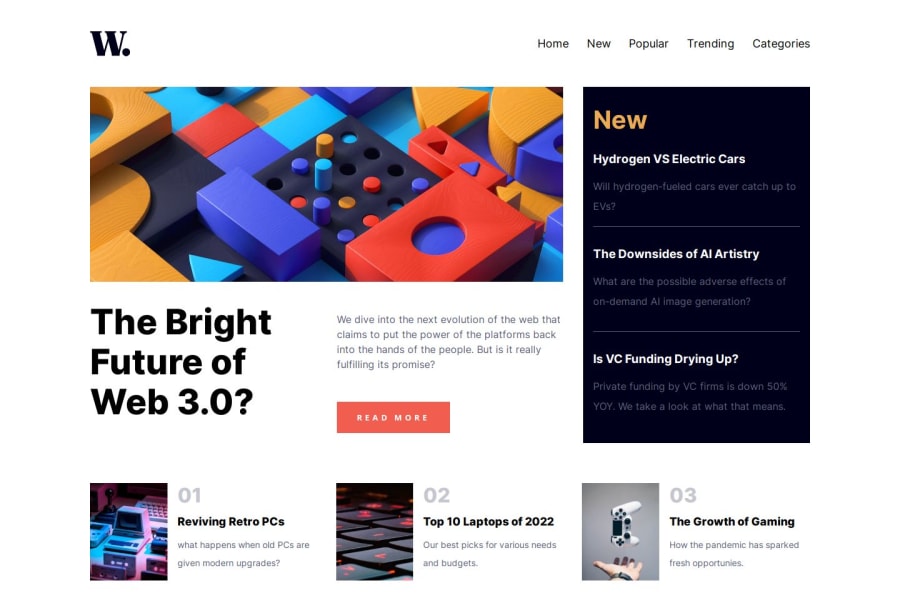
Design comparison
SolutionDesign
Solution retrospective
-It was a bit challenging but then we learn by pushing through challenges. -Used both grid and flexbox in the makeup -Code is a bit messy though
Community feedback
- @danielmrz-devPosted 9 months ago
Hello @awwsman!
You did a very good job there!
I have a very simple suggestion for improvement:
- Since the items on the navigation menu are clickable elements, it's nice to add
cursor: pointer
to them.
š This gives the user a visual indication that the element is clickable, as obvious as it may look.
I hope it helps!
Other than that, you did a great job!
Marked as helpful1@awwsmanPosted 9 months agoThank you very much for your feedback, will do that right away. cheers. @danielmrz-dev
1 - Since the items on the navigation menu are clickable elements, it's nice to add
Please log in to post a comment
Log in with GitHubJoin our Discord community
Join thousands of Frontend Mentor community members taking the challenges, sharing resources, helping each other, and chatting about all things front-end!
Join our Discord