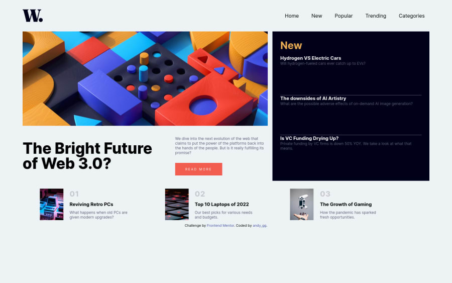
Responsive w/ flex and grid, button interactions, js for mobile menu
Design comparison
Please log in to post a comment
Log in with GitHubCommunity feedback
- @Dytoma
Hey👋
Good job on completing this challenge👏you've done a great job
However I have some suggestions that you can use to improve your code:
-
Firstly when you submit a solution, you can have a look at the Accessibility Report and the HTML Validation Report that gives you useful information and some mistakes that you would want to solve. You can see in the reports that you use multiple IDs twice and as you know IDs have to be unique so you can change one of the duplicated ones.
-
Secondly I'll suggest you use classes instead of IDs. It helps you avoid multiple debugging problems and classes allows you to style multiple elements at a time. There's more reasons to that, you can read more about this on class vs id DEV article.
-
Lastly instead of using your
<div id="banner-image"></div>empty, I suggest you append animgelement to thatdivand then useobject-fitproperty inCSSto style as you want.(<div class="banner-image"><img src="./assets/images/image-web-3-desktop.jpg" alt="Desktop image"/></div>).
That's all for me, Happy coding🙌
-
- @AhmedMahrouss
good jop my bro Congrats on completing your challenge!🎊🍻If you have any questions or need further clarification, feel free to reach out to me. Happy Coding! 🎆🎊
Join our Discord community
Join thousands of Frontend Mentor community members taking the challenges, sharing resources, helping each other, and chatting about all things front-end!
Join our Discord
