News Homepage React TypeScript SCSS


Design comparison

Solution retrospective
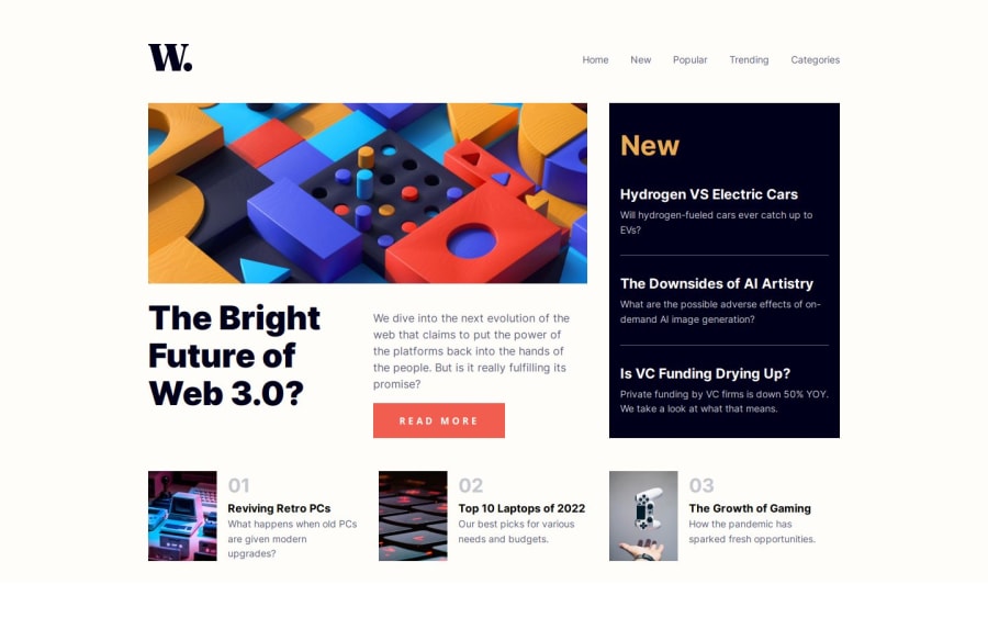
In this project, my main challenge was achieving perfect symmetry with all elements in the design, particularly dividing the available space into thirds and fitting different parts of the content accordingly. I discovered that using flex properties (grow, shrink, and basis) wasn't the ideal solution, as flexbox calculations include paddings and margins. Ultimately, I employed a combination of grid and flex to achieve a close, though not perfect, resemblance to the original design. Fortunately, I gained valuable insights into both systems throughout this process.
Additionally, animating the modal for the links on mobile proved to be quite challenging. However, in future projects, I aim to achieve a seamless animation and transition, as I believe I've learned a great deal from this experience.
Looking ahead, one approach I would take differently in similar projects is to create a .json or data.js file containing all relevant content data for the site and fetch it from the app. This would simulate a more realistic real-life usage scenario and streamline the development process.
What specific areas of your project would you like help with?If you have any suggestions for improvement or notice any potential areas for optimization or bad practices in the codebase, please don't hesitate to reach out, especially regarding the modal system and symmetry distribution.
Community feedback
Please log in to post a comment
Log in with GitHub
Join our Discord community
Join thousands of Frontend Mentor community members taking the challenges, sharing resources, helping each other, and chatting about all things front-end!
Join our Discord