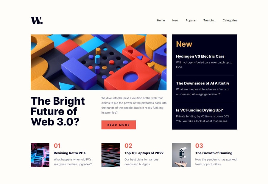
News homepage (React | Sass)
Design comparison
Community feedback
- @wendyhamelPosted 2 months ago
Great solution to this challenge!
Your solution is extremely close to the screenshot and resizes nice on smaller screens. It does have a scrollbar on larger screens, when all the content is visible, so you might want to adjust the
.margin-block: 90pxon<main>to just margin top for example.You might want to look into more use of semantic HTML to reduce the meaningless div's for better accessibility. The
.news-containerand.populair-containercould be<article>'s instead of a<div>'s.Last, a very small design difference: in the screenshot the text of the
read morebutton is black, but in the design it is white.Happy coding!
1@marcfrancissPosted 2 months ago@wendyhamel Thanks checking my solution for this challenge and for the feedback! 😊 Really appreciate your suggestion on using
<article>to improve the semantic structure.0
Please log in to post a comment
Log in with GitHubJoin our Discord community
Join thousands of Frontend Mentor community members taking the challenges, sharing resources, helping each other, and chatting about all things front-end!
Join our Discord
