Design comparison
Community feedback
- @tatasadiPosted 11 months ago
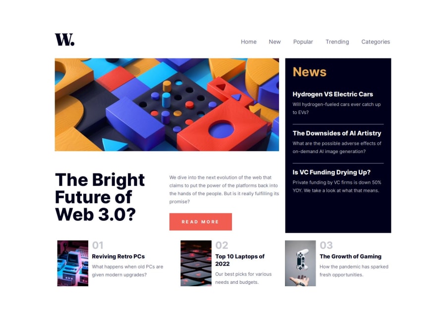
Very good job on completing this Frontend Mentor challenge! Your project looks very promising, and the structure you've implemented using React components is well thought out. Here are a few small suggestions to further refine your work:
Logo and Navbar Alignment
From medium (md) screen sizes and up, ensure the logo is vertically aligned with the navbar items. This might require adjusting the flexbox properties or margins/padding specifically for these sizes to achieve a visually balanced layout.
Grid Layout Adjustment
While the main grid setup works well for mobile view, consider moving your grid layout inside the main tag for desktop views to avoid stretching content unnecessarily due to
min-h-screen. This change could help manage the extra spaces more effectively and ensure content is distributed as intended across different screen sizes.Single H1 Usage
Ensure there's only one
<h1>element used on the whole page to maintain semantic HTML practices and improve SEO. The<h1>tag should represent the main topic of your page. For other headings, use<h2>,<h3>, etc., to indicate subheadings and maintain a hierarchical structure.Implementing these suggestions will not only enhance the aesthetics and alignment of your project but also improve its semantic structure and accessibility. Keep up the great work!
Marked as helpful0
Please log in to post a comment
Log in with GitHubJoin our Discord community
Join thousands of Frontend Mentor community members taking the challenges, sharing resources, helping each other, and chatting about all things front-end!
Join our Discord
