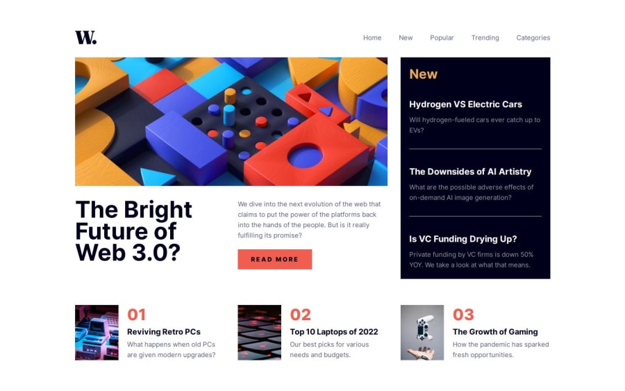
news-homepage-main
Design comparison
Solution retrospective
I'm proud of the overall work that I've done, it took me less than 3 hours (starting with mobile-first approach).
What challenges did you encounter, and how did you overcome them?When started the challenge, I tried the desktop-first approach (creating the desktop screen size layout first than using media queries to create the mobile layout) and that was a BAD choice and it became too much complex. So I deleted the whole code and started from scratch and it was a lot easier.
What specific areas of your project would you like help with?I need some help on how to make the mobile menu do the transition from the right of the screen instead of just pop-in out.
Community feedback
- @KapteynUniversePosted 5 months ago
Hey Aymane, nice job.
Easy way i see to implement to your code is add
transition: 1s ease-in;to theheader nav #mobile-nav .mobile-menuand change hidden to this..hidden { /* display: none !important; */ right: -100% !important; }This will place the nav off screen and with transition it won't pop-up, but might cause some overflow issues. This is how i made the animations of the last challenge i did. I got recomended 2 videos on that challenge, i didn't check them yet but might be useful to you.
Edit; Also adding a visibility hidden might be good too
Marked as helpful0
Please log in to post a comment
Log in with GitHubJoin our Discord community
Join thousands of Frontend Mentor community members taking the challenges, sharing resources, helping each other, and chatting about all things front-end!
Join our Discord
