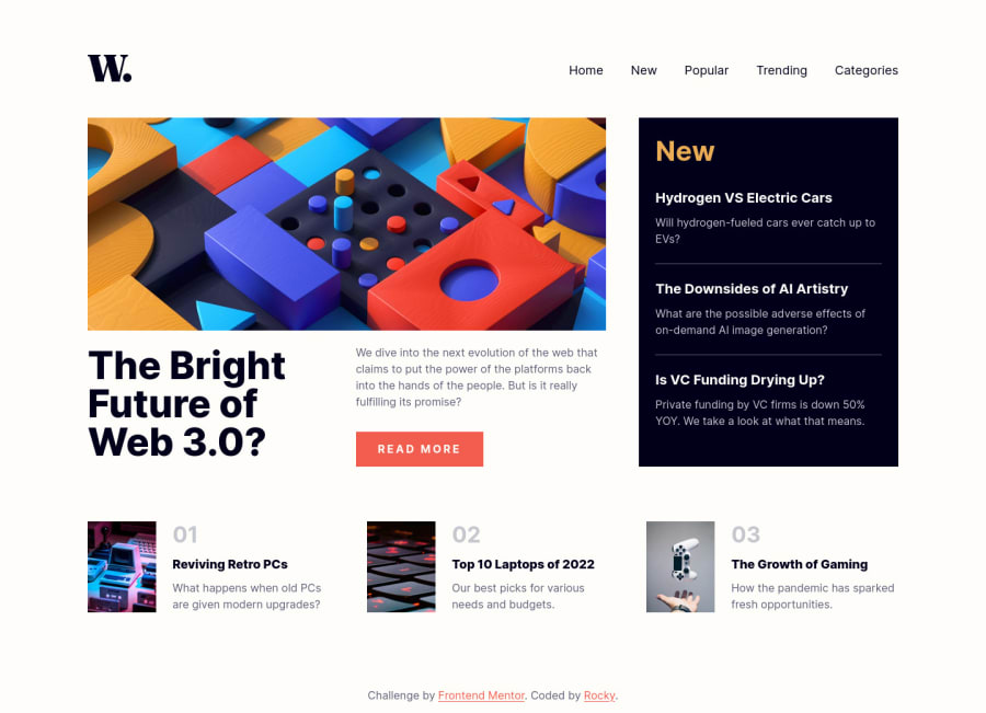
News Homepage Main Solution | Responsive | Mobile-first
Design comparison
Solution retrospective
Would love some feedback on this.
Community feedback
- @CurseTommyPosted about 2 years ago
Hi @Drougnov 👋, good job completing this challenge! 🥳
Your side and code looks perfect, good hover transition, and awesome hamburger menu buttons.
Overall good job, and keep it up 😁👋
1 - @codeguy9Posted about 2 years ago
Hi! Your work is awesome. How did you manage to have no errors? I would like some tips to not have 'accessibility reports' and 'html validation reports'.
Thanks!
1@DrougnovPosted about 2 years agoHi @codeguy9, thanks for the feedback.
When I make errors, I read the reports and update the codes. Even on this project, I had three HTML validation errors. I checked the reports, figured out what I have done wrong and fixed them.
When I dont understand the error well, i google the report header for more information. Make sure to explore some blogs about accessibility too.
If you have troubles fixing any specific errors, feel free to ask. I'll try my best to help you. Have a good day :)
1
Please log in to post a comment
Log in with GitHubJoin our Discord community
Join thousands of Frontend Mentor community members taking the challenges, sharing resources, helping each other, and chatting about all things front-end!
Join our Discord