Design comparison
SolutionDesign
Solution retrospective
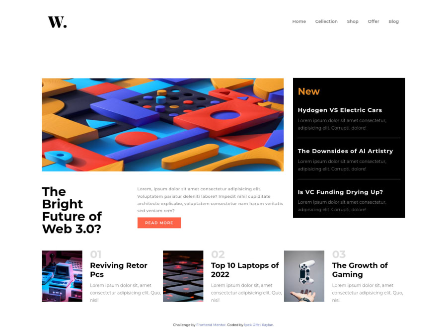
It was a simple application but there was a space between the navbar and main and I couldn't understand why. You'll see what I mean when you look at it. Please check and tell me why. Your return is important to me.
Community feedback
- @karimAoulallayPosted almost 2 years ago
Hello, these are the reasons causes that space :
- You gave a div with .images class a margin-top of 100px.
- Also div with .news-box class you gave it a margin-top.
- Div .main-box class has align-items: center which causes that space, it pushes the "new" section to the bottom.
- I noticed that you used a picture for mobile sizes at the large-size screens, that's why it looks shrank.
- I hope you got my point.
- Good luck.
Marked as helpful0
Please log in to post a comment
Log in with GitHubJoin our Discord community
Join thousands of Frontend Mentor community members taking the challenges, sharing resources, helping each other, and chatting about all things front-end!
Join our Discord
