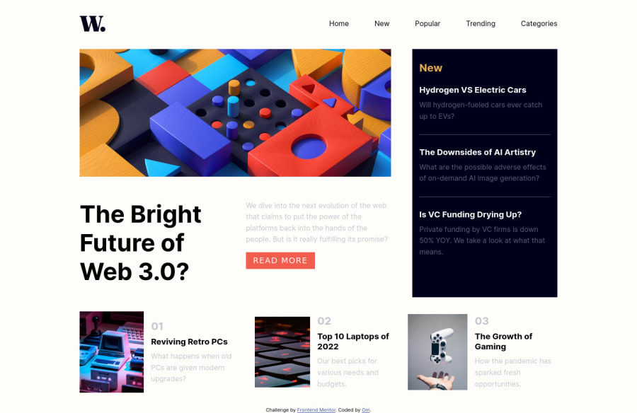
Design comparison
Solution retrospective
Feedback will be helpful
Community feedback
- @VCaramesPosted about 2 years ago
Hey there! 👋 Here are some suggestions to help improve your code:
-
The
nav
is not part of the Main Element, so it should be outside of it. -
The
nav
should be wrapped in aheader
element. -
The “Read More” button was created with the incorrect element. When the user clicks on the button they should bedirected to a different part of you site. The Anchor Tag will achieve this.
-
The articles inside the "New section need to be clickable, so an Anchor Tag needs to be included in their HTML. The same goes for the articles inside the ".others" class.
-
Your CSS Reset is extremely bare and being underutilized. To fully maximize your CSS reset, you want to add more to it.
Here are few CSS Resets that you can look at and use to create your own or just copy and paste one that is already prebuilt.
https://www.joshwcomeau.com/css/custom-css-reset/
https://meyerweb.com/eric/tools/css/reset/
http://html5doctor.com/html-5-reset-stylesheet/
If you have any questions or need further clarification, feel free to reach out to me.
Happy Coding! 🍂🦃
0 -
Please log in to post a comment
Log in with GitHubJoin our Discord community
Join thousands of Frontend Mentor community members taking the challenges, sharing resources, helping each other, and chatting about all things front-end!
Join our Discord