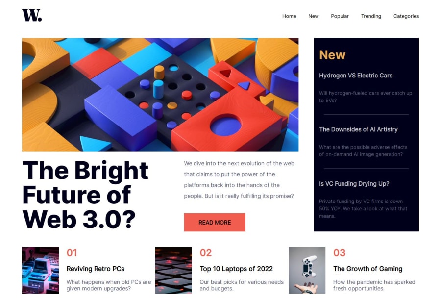
Design comparison
Solution retrospective
This project took way longer than i expected because i had to switch from using flex to using grid.
Any comment will be helpful so i can make it much better
Community feedback
- @KapteynUniversePosted 6 months ago
Hey Michael, nice job.
Page overly stretched on big screens. Probably at this stage it will cause issues but i recommend you to wrap the content inside header, main etc. and give it a max-width and margin value for next time. For this challenge, i guess you can put something like this to body
body {
    width: 90%;
    max-width: 1440px; /* Give it any value you prefer */
    margin: 0 auto;
}
For better accesibility and semantics:
Turning nav bar section into a header and put it between body and main might be better.
Right now it is not possible to focus some active states on the design with keyboard tab button besides nav items and read more button. Giving h3s under the news section and p tags in the second container an anchor tag might be better, since they have active states, they are probably links to direct another page. I would also change the read more button to a tag too.
Not 100% sure about this but wrapping navigation open/close img into a button might be better too.
To use different images that change on different screen sizes, use picture tag.
<picture>
  <source media="(min-width:XXXpx)" srcset="desktop img path">
  <img src="mobile img path" alt="">
</picture>
This is just a design choice i usually make, maybe you like it: I use
position:fixed;for the mobile sidebar navs so when you open the nav and scroll down, nav moves with the screen.Marked as helpful2
Please log in to post a comment
Log in with GitHubJoin our Discord community
Join thousands of Frontend Mentor community members taking the challenges, sharing resources, helping each other, and chatting about all things front-end!
Join our Discord
