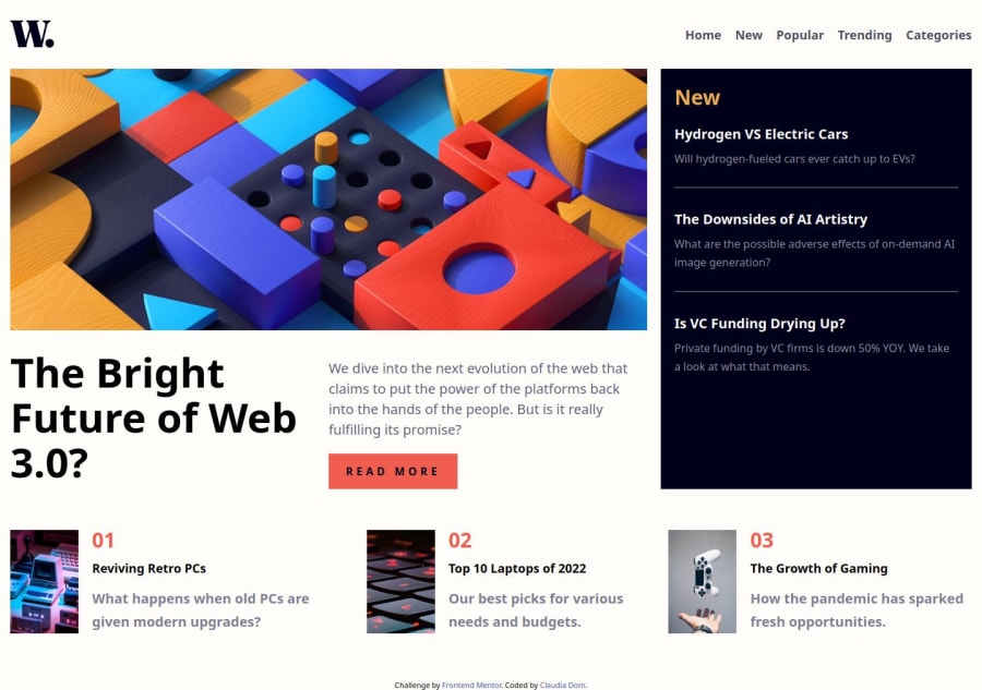
news-homepage-focused on semantics and grid
Design comparison
Solution retrospective
It is accesible and resposive
What challenges did you encounter, and how did you overcome them?The menu was a challenge but I solved it with js and css
What specific areas of your project would you like help with?Any advice to improve is appreciated!
Community feedback
- @KapteynUniversePosted 5 months ago
Hey Claudia, nice job.
Page overly stretched on big screens. Probably at this stage it will cause issues but i recommend you to wrap the content inside header, body etc. and give it a max-width and margin value for next time. Right now, i guess you can use something like this
body {
    width: 90%;
    max-width: 1440px; /* Give it any value you prefer */
    margin: 0 auto;
}
Right now it is not possible to focus anything with keyboard tab button besides W logo and read more button.
For better accebility; giving nav list items, h3s and h4s an anchor tag might be better, since they have active states, they are probably links to direct another page. I would also change the read more button to a tag too.
<ul class="nav-links">
            <li><img src="/assets/images/icon-menu-close.svg" alt="Icon menu close" class="menu-close"></li>
            <li class="home"><a href="#">Home</a></li>
            <li><a href="#">New</a></li>
            <li><a href="#">Popular</a></li>
            <li><a href="#">Trending</a></li>
            <li><a href="#">Categories</a></li>
</ul>
Not 100% sure about this but wrapping navigation open/close img into a button might be better too.
Marked as helpful1@ClaudiaRamirezDPosted 5 months ago@KapteynUniverse Thank you so much for your feedback, I made some changes accordingly, I was confused about the difference between tabbable and just available for screen readers, I hope I'm getting it now.
1
Please log in to post a comment
Log in with GitHubJoin our Discord community
Join thousands of Frontend Mentor community members taking the challenges, sharing resources, helping each other, and chatting about all things front-end!
Join our Discord
