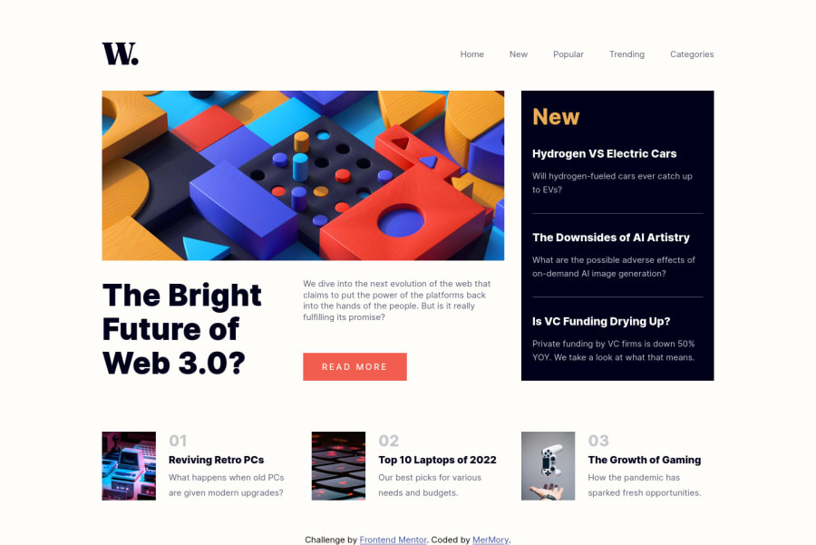
Design comparison
Solution retrospective
good exercise, learned a lot like knowing that when both CSS and JavaScript target the same element, then the JavaScript changes are applied over CSS.
Community feedback
- @VCaramesPosted almost 2 years ago
Hey there! 👋 Here are some suggestions to help improve your code:
- This LINK needs to be a
button
⚠️ since currently it is not accessible.
- The
button
should also have ⚠️ anaria-label
,aria-control
and aaria-expanded
.
- The company logo should be outside ⚠️ the
nav
and itsalt-tag
description should state the company's name; in this case, "W News"
- This LINK should be ⚠️ an
article
element and not asection
.
- The headings in your site are being used incorrectly❌. Since the
h1
heading can only be used once ⚠️, it is always given to the heading with the highest level of importance. For this challenge, it is actually visually hidden.
- The "The Bright Future of Web 3.0?" Is **not an **
h1
heading ❌, it is another article heading. It should be anh2
heading ✅ and there should be a visibly hiddenh1
in the site.
- Numbers are never ❌ headings.
- Your "buttons" were created with the incorrect element ❌. When the user clicks on the button they should be directed to a different part of you site. The
anchor tag
will achieve this.
More Info:📚
- The “image” in this component are purely decorative⚠️. Their
alt tag
should be left blank to hide them from assistive technology.
More Info:📚
https://www.w3.org/WAI/tutorials/images/
These are just a few of the things that needs correction. There are still a lot more things that need fixing...
If you have any questions or need further clarification, feel free to reach out to me.
Happy Coding! 👾
Marked as helpful1@MerMory-AllocPosted almost 2 years agoHi @vcarames thanks for the feedback, really helpful and insightful information here that made me rethink about the importance of the accessibility.
I did update my code depending one this feedback and i just want to ask and to know why you see that the first section should be an article? because i just see it as a section that contains just a presentation of an article and does not contain an actual article.I don't know maybe i am wrong i just want a lit bit of guidance here. Thanks
also you said that there are other things that needs fixing , I will be happy to point me to them. and Thanks again
0@VCaramesPosted almost 2 years ago@MerMory-Alloc
Glad I could help!
The
section
element is used to define a group of related content and this just one single article… so it make no sense to wrap the entire thing in asection
element.Not only that it checks off all the requirements for the
article
element; make sense on its own and be independently distributable (can be used in on another site).Hope this clear things up.
Marked as helpful1@MerMory-AllocPosted almost 2 years ago@vcarames Thanks you really made it clear for me.
0 - This LINK needs to be a
Please log in to post a comment
Log in with GitHubJoin our Discord community
Join thousands of Frontend Mentor community members taking the challenges, sharing resources, helping each other, and chatting about all things front-end!
Join our Discord