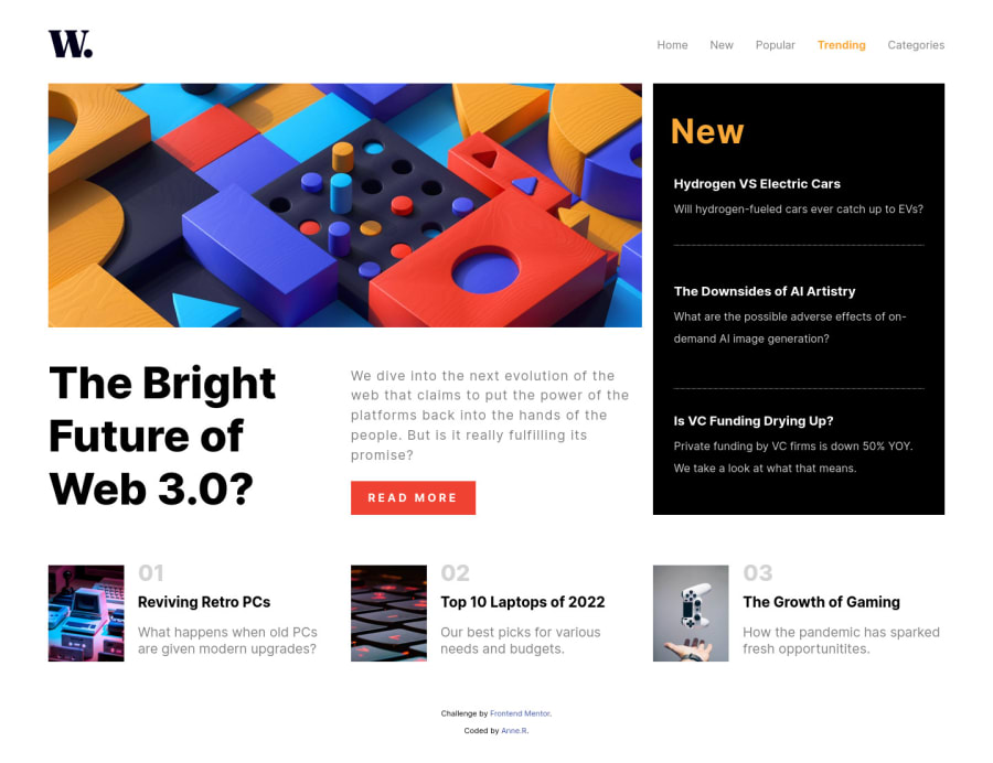
Mobile responsive solution using CSS Grid and Flexbox
Design comparison
Solution retrospective
This is my very first challenge on frontend mentor and I can't wait to start a new one :)
I've had a lot of fun doing it. It helped me improve my knowledge of CSS grid as well as getting better on the responsive part.
The most difficult element for me of this challenge was the navbar and more particularly the js code related to it: I'd be happy to learn if there's a better way to do it.
Thank you and have a nice day
Community feedback
- @gtalnzPosted almost 2 years ago
Hi Anne,
Great job for your first project here! I've just completed this one too and also found the navbar to be quite a challenge.
I think your approach with the JavaScript is basically the same as what I have done. My main feedback there would be to use IDs for specific elements you want to add JS handlers to, rather than classes.
You also appear to have written some JS to toggle classes on mouseover events for some elements. This wasn't working reliably when I was previewing your page (the classes were added but were not removed correctly). Could a better result be achieved in pure CSS with a hover selector, like you've done for the nav menu items and the 'Read More' button?
As far as non-JS feedback goes, take a look at the Accessibility Report the site has given you here. You've correctly nested your nav inside a header tag. Consider doing similar with a main tag for your page content and a footer tag for the attribution section.
Your .container div has a width set to a fixed value of 1300px by default. That means at screen sizes between 760px and 1300px the content overflows to the right. Changing the 'width' property to 'max-width' would fix this.
Your .list-card-1,-2, and -3 elements could share a single 'list-card' class instead. The grid-column properties you've given each one individually are redundant since they all take up the next available grid cell anyway.
My final input: In a number of places you have used pixel units for CSS values, particularly padding and margin. I would encourage you to try using more dynamic units like 'em', which are more responsive when users adjust their zoom settings for accessibility purposes.
If you get a chance, please check out my solution and give me some feedback as well. I'd really appreciate it!
Marked as helpful0 - @AnneRubioPosted almost 2 years ago
Hello Geoff, Many thanks for your useful feedback. I will take the most of it to improve my current code :) On my side I've had a look at your code and live page which are great: kudos! I have a very minor feedback:
- In the HTML, I believe the link with the script/js file is in general put at the end of the body for a better performance. This is not mandatory in a project like this one but rather a best practice to follow in general.
- The hover and active elements seem to be missing Cheers
0@gtalnzPosted almost 2 years ago@AnneRubio Thanks for the feedback :)
The technique of putting scripts at the end of the body used to be best practice, but there is now a better way: include them in the head and add a 'defer' attribute. This tells the browser to download the script in parallel with the HTML, but to wait until the HTML is ready before running the code.
See W3 Schools for more info.
You're absolutely right about the hover and active elements. I missed them out completely. I'll be sure to focus on them (pardon the pun) in my next challenge, and hopefully they look as good as your Read More button did in this one (I'll be taking inspiration from it!).
0
Please log in to post a comment
Log in with GitHubJoin our Discord community
Join thousands of Frontend Mentor community members taking the challenges, sharing resources, helping each other, and chatting about all things front-end!
Join our Discord
