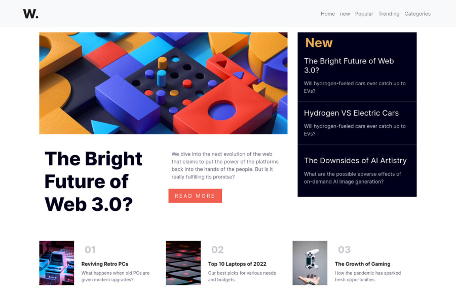
Design comparison
Solution retrospective
please provide your valuable feedback.
Community feedback
- @dwhensonPosted about 2 years ago
Hey @Someshwari - Lovely job here.
The site looks great and responds well. Here's a couple of points to think about:
- You are getting some error messages from the linter about missing heading levels. This is because you should use the <h1> headings as the single, main heading of your web page, followed by the <h2> headings, then the less important <h3> headings, and so on, without skipping a level.
We shouldn’t use headings to make text look BIG or bold. Use them only to set out your document's heading and show the document structure, and then change things up with CSS after that.
I approach this by first laying out the page using only HTML and only thinking about the document structure, not design at all, and then once done, I return to the page and use CSS to make things look how they should.
This is important as many people using assistive tech to access your pages will navigate the site based on the heading structure. At the moment this wouldn’t work with your HTML.
- I wonder whether your
buttonshould actually be a link. I imagine that it will take me to another page to read more? If so it should be a link. Again, the most important thing is what the element will do not what it looks like. This page has a great summary and lots of useful links on this: https://css-tricks.com/buttons-vs-links/
Hope this helps a bit and gives you something to think about for the next challenge!
Keep up the good work. Dave
1@someshwari-rudraPosted about 2 years ago@dwhenson thanks for your great feedback. i will try to improve my code and also going to follow your approach as mentioned above.
0
Please log in to post a comment
Log in with GitHubJoin our Discord community
Join thousands of Frontend Mentor community members taking the challenges, sharing resources, helping each other, and chatting about all things front-end!
Join our Discord
