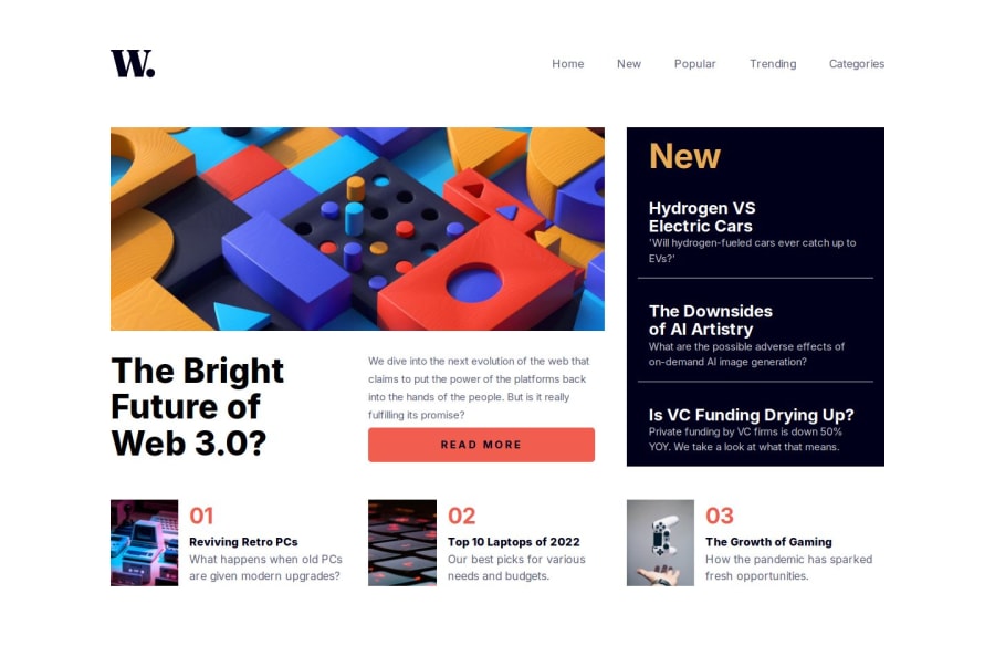
Design comparison
SolutionDesign
Solution retrospective
What are you most proud of, and what would you do differently next time?
This is my most accessible project so far. It took many hours to find all the right resources and double check and manually test all the things I needed for the project
What challenges did you encounter, and how did you overcome them?The mobile menu was a challenge that proved to be very rewarding. It took quite a few hours of trying and testing different solutions to find one that worked.
What specific areas of your project would you like help with?Any advice on accessibility and general UI layout would be appreciated
Community feedback
Please log in to post a comment
Log in with GitHubJoin our Discord community
Join thousands of Frontend Mentor community members taking the challenges, sharing resources, helping each other, and chatting about all things front-end!
Join our Discord
