Submitted about 3 years agoA solution to the News homepage challenge
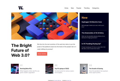
News Homepage (Comprehending Display: Flex)
@CodeLamp168

Solution retrospective
This project took me about 3 hours to make. Its the project that gave me a general understanding of positioning content within my HTML using flex and other syntaxs to make my content responsive. Please give me your thoughts on the structure and use of css if you can.
The js was simple enough however I'm still unable to find a solution for the background blur. I will continue to look for a solution. But if you have any possible solutions as well, please feel free to tell me.
Code
Loading...
Please log in to post a comment
Log in with GitHubCommunity feedback
No feedback yet. Be the first to give feedback on Caleb Sim's solution.
Join our Discord community
Join thousands of Frontend Mentor community members taking the challenges, sharing resources, helping each other, and chatting about all things front-end!
Join our Discord