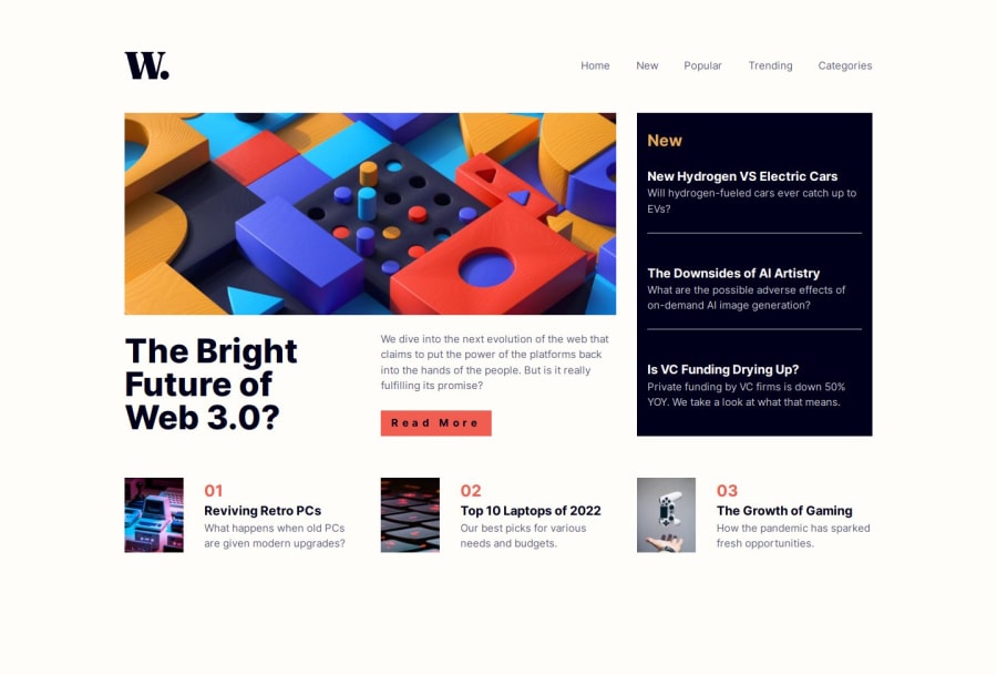
Design comparison
Solution retrospective
I would like to get feedback about grid (had some troubles with imgs), accesibility and semantics. I didn't put aria-labels to anchor elements (except the read more button) because i tought they have enough text information inside them. Is that a right approach?
Also one thing i couldn't manage is when the navigation bar opened, it is possible to focus background elements like read more button, news. with tab key, which i do not want.
Please log in to post a comment
Log in with GitHubCommunity feedback
- @AdrianoEscarabote
Hi KapteynUniverse, how’s everything? I think your project turned out great! However, I have some feedback that I think might be useful:
images must have alt text unless it is a decorative image, for any decorative image each IMG tag must have empty alt="" and add aria-hidden="true" attributes to make all the assistive technologies of the Web, as screen reader.
Learn the differences between decorative/meaningless images vs important content.
If we see how the layout is behaving at higher resolutions, with the help of google dev tools, we will see that it is stretching a lot, to solve this we can use a max-width with the value we want the content to stop growing and to center use a margin: 0 auto;
.wrapper {
    padding: 0 20px;
    max-width: 1440px;
    margin: 0 auto;
}
The rest is amazing.
I hope this is helpful. 👍
Marked as helpful
Join our Discord community
Join thousands of Frontend Mentor community members taking the challenges, sharing resources, helping each other, and chatting about all things front-end!
Join our Discord
