

Design comparison

Solution retrospective
After over half a year break from web development I decided to return (<2 years total experience before this break). I chose this particular challenge because I imagined it would be a decent place to start! I found it challenging, particularly in regards to remembering how layouts work and adjusting the layout for RWD. I also had to brush up on basic JS again in order to add the mobile menu.
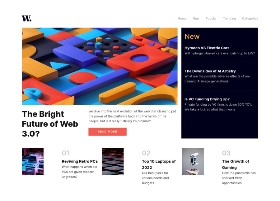
That being said, I think it turned out well! Please, feedback would be amazing! I struggled with getting the hamburger aligned and I also didn't do any transitions here as I don't know how to do them properly, so the hamburger remains, well, a hamburger and doesn't transform into a close icon. Any help with this would be appreciated. I also struggled with the bottom part of the layout involving getting the size proportions of the images relative to the text next to it correct. In RWD the images are too far away from the text. My method was to reduce the width of the image and I also tried to manually assign a value to the grid area with the image in to be smaller than the grid area with the text. Reducing the image width worked but it didn't adjust the grid area. As you can see from the demo, it hasn't worked! I have struggled with this in the past with mock projects and so any help clearing this up would be amazing!
Thanks!
Community feedback
Please log in to post a comment
Log in with GitHubJoin our Discord community
Join thousands of Frontend Mentor community members taking the challenges, sharing resources, helping each other, and chatting about all things front-end!
Join our Discord