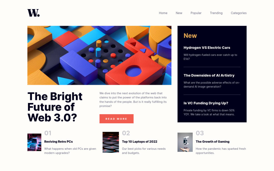
Design comparison
Solution retrospective
Any feedback or suggestion would be appreciated.
Community feedback
- @RamonDonadeuPosted over 2 years ago
I just wanted to say that, the mobile version, when the menu is open you can scroll and the menu goes up and looks wired. Use position: fixed. It worked well for me
Marked as helpful0 - P@christopher-adolphePosted over 2 years ago
Hi @Shady-Omar 👋
You did a great job on this challenge. 👍 Here are a few things that I have noticed and that you might want to check in order to improve your solution.
HTML:
While the page you built is good, you could improve it by using HTML semantic elements in the following ways:
- For the navigation, you could wrap the
<ul>element in a<nav>element like this:
<nav> <ul> <li> <a href="#">Home</a> </li> <li> <a href="#">New</a> </li> <li> <a href="#">Popular</a> </li> <li> <a href="#">Trending</a> </li> <li> <a href="#">Categories</a> </li> </ul> <nav>- The
<a>element is also missing for your navigation. - Try as much as possible to refrain from duplicating
HTMLelements on your page because this hinders the maintainability of your code. You can use the same markup for the navigation on both mobile and desktop and adapt the styles by usingCSSmedia queries. - You could replace the
<div class="top-content">and<div class="bottom-content">by a<section>element. - For the "New" section, you could replace the
<div class="top-right">as well as it children<div class="text">elements by an<article>like this:
<article class="new-post"> <h2>New</h2> <article class="new-post__item"> <h3>Hydrogen VS Electric Cars</h3> <p>Will hydrogen-fueled cars ever catch up to EVs?</p> </article> ... </article>- You could replace the
<div class="topic">by an<article>. - The "Read More" looks like a
<button>element but it is in fact an<a>element that will allow the user to navigate to a page where he/she will have access to the whole post. Therefore you should probably define aCSSrule that you can apply to an<a>element so that it looks like a button. 😉 - Instead of using
CSSclasses to handle responsive images, you could use the<picture>element together with the<source>element to achieve same like below:
<picture>
  <source media="(min-width: 1110px)" srcSet="assets/images/image-web-3-desktop.jpg" />
  <source media="(min-width: 768px)" srcSet="assets/images/image-web-3-mobile.jpg" />
  <img src="assets/images/image-web-3-desktop.jpg" alt=alt="web3" />
</picture>
CSS:
- In general try to give meaning names to your
CSSclasses. This will not only help you as well as those you collaborate with you on a project to understand much faster what a particularCSSrule should be used for but will also help to organise your styles better. - Try to keep the level of nesting to a maximum of 3 levels deep as this hinders the reusability of your
CSSrules. In other words, when you are overly specific, you will have to increase the nesting even more if you want to override any particularCSSrule. The rule of thumb is to define your generic rules first and then define more specific ones for other use cases.
// DON'T ☝️👎
main .content .top-content .top-right .text h3 {
  margin-bottom: 1rem;
  font-weight: 800;
}

// DO 👌👍
h3 {
  margin-bottom: 1rem;
  color: hsl(240, 100%, 5%);
  font-size: 1.25rem;
  font-weight: 800;
}

.article__item h3 {
  margin-bottom: 0.5rem;
  color: hsl(36, 100%, 99%);
  font-size: 1rem;
}
RESPONSIVE:
- On the tablet viewport, the content looks squeezed and there is a huge white space under the "The Bright Future of Web 3.0" section. It would look better if you set this top section in a single column layout on this viewport.
I hope this helps.
Keep it up.
Marked as helpful0 - For the navigation, you could wrap the
Please log in to post a comment
Log in with GitHubJoin our Discord community
Join thousands of Frontend Mentor community members taking the challenges, sharing resources, helping each other, and chatting about all things front-end!
Join our Discord
