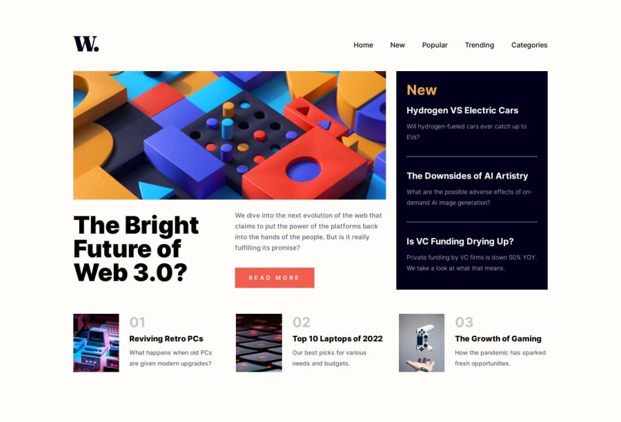
News Homepage built with SASS
Design comparison
Solution retrospective
Hello! I'm Daniel and this is my solution for this challenge! 😊
Definetely not my best work... I underestimated this challenge and have paid the price... 😅
I couldn't quite get the menu correctly on mobile version and faced many different problems with the layout on desktop version too. I had to use fixed values on the container grid because I just couldn't do it other way.
I decided to post the solution anyway because I can't do more than that with my current knowledge. I intend to redo this challenge in the future. For now, that's what I've got.
If you have any suggestions on how I can improve this project, feel free to leave me a comment!
Feedback welcome 😊
Community feedback
- @techyjcPosted 12 months ago
Hi Daniel,
Great work! I did this challenge. The responsive aspect caused me a few problems, it can mean adding in multiple break points because the areas in the design like the 'new' section start looking a bit odd at various screen sizes. Like that you went your own way with the menu hover. I managed to re-create the menu hover underline using pseudo elements (
::before) and/or (::After) but it took a little bit of experimentation.I initially looked at your CSS and thought if you had used the classes to address the descendant elements directly to reduce specificity but then realised that you were using SASS and were most likely nesting the your CSS selectors.
Again, great work!.
2 - @ArafAfifPosted 12 months ago
Your solution looks very good. But if you change your h1 color the solution will be more match the design.
1
Please log in to post a comment
Log in with GitHubJoin our Discord community
Join thousands of Frontend Mentor community members taking the challenges, sharing resources, helping each other, and chatting about all things front-end!
Join our Discord
